An interview with Alessandro Bolchi, Creative Director, published October 7th 2025 on Creativepool.
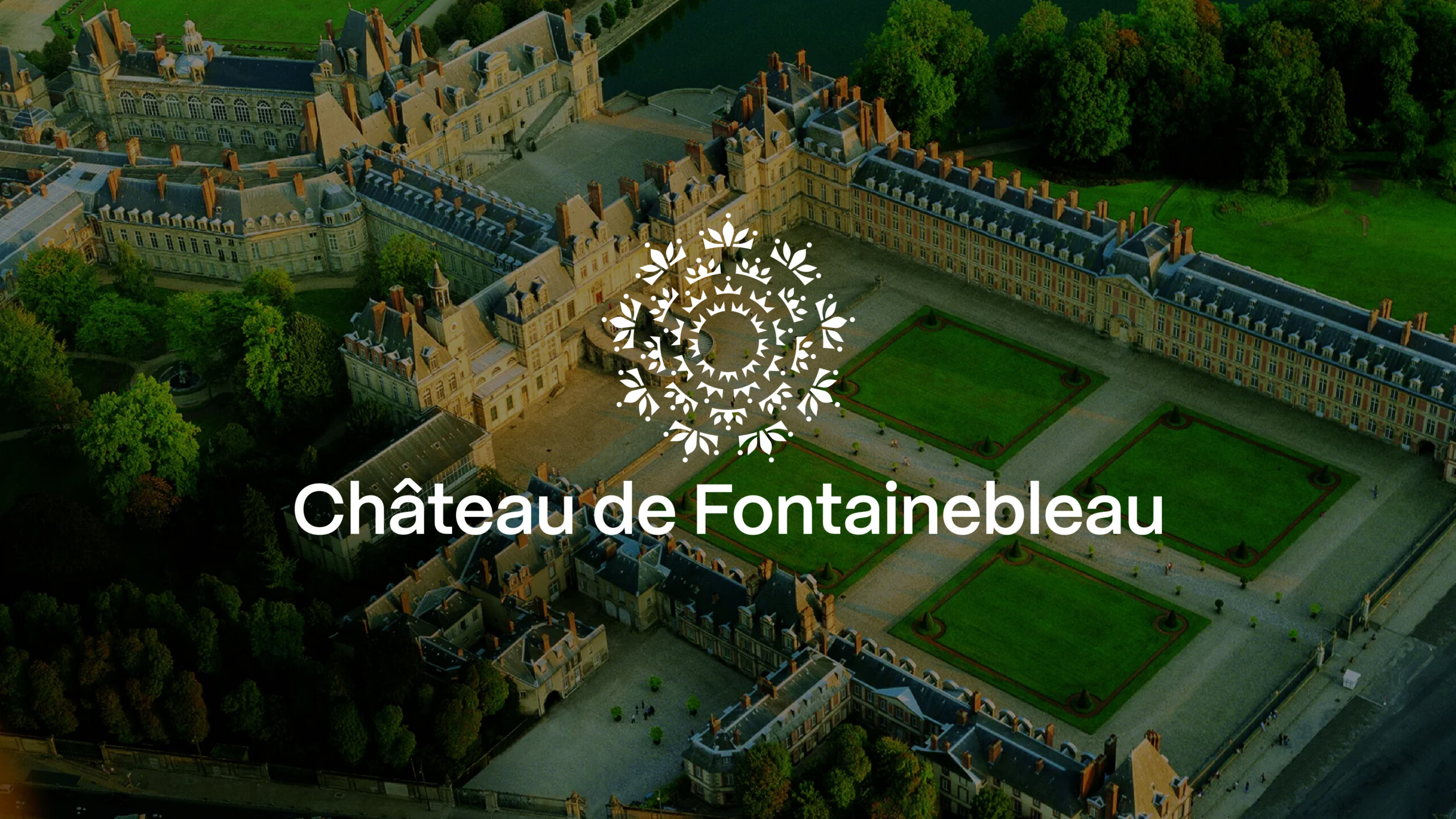
Lonsdale Redefines the Château de Fontainebleau: A Modern Identity Rooted in History
When tasked with reimagining the identity of one of France’s most historically rich landmarks, Lonsdale faced a rare creative challenge, to honour the past while designing for the future. The Château de Fontainebleau, home to 36 sovereigns over eight centuries, sought a refreshed visual identity that could resonate with modern audiences while preserving its regal heritage.
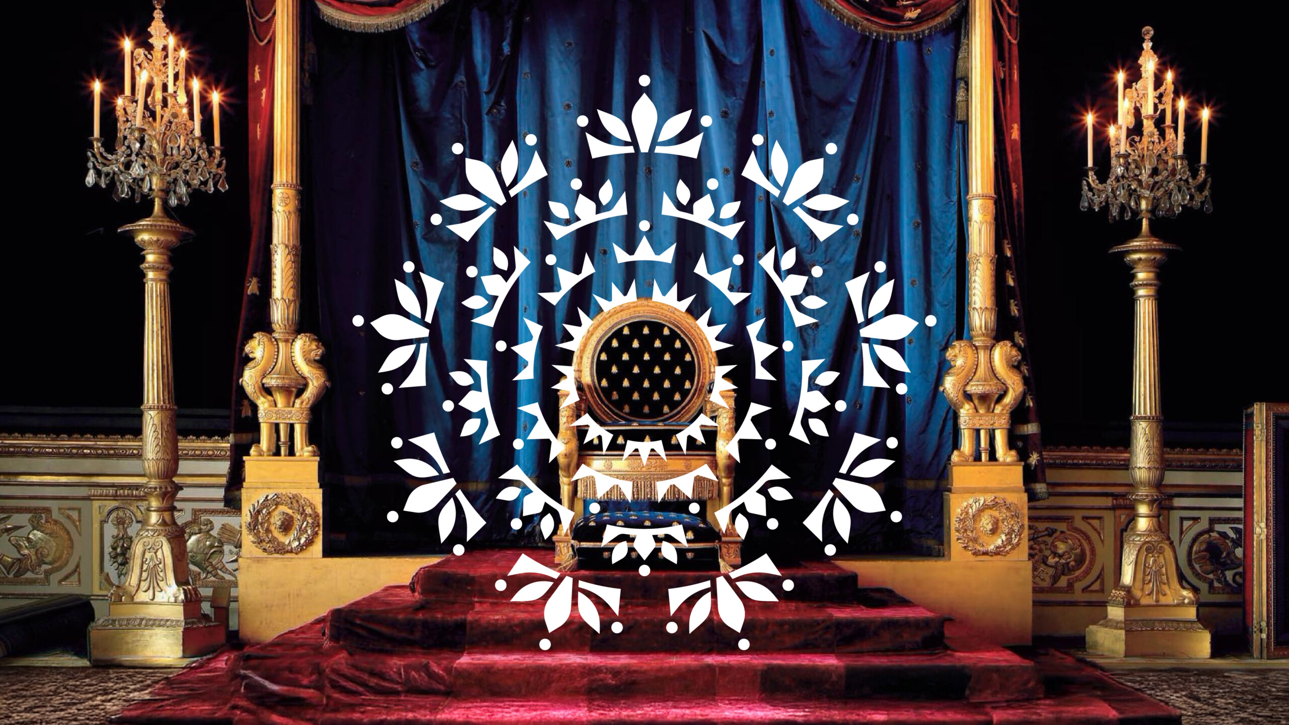
Guided by the theme of extraordinary continuity, Creative Director Alessandro Bolchiand his team immersed themselves in the spirit of Fontainebleau, its architecture, forests, and centuries-old craftsmanship. The result is a timeless emblem: a seal of 36 crowns symbolising every ruler who shaped the Château’s legacy. This contemporary yet deeply symbolic identity bridges history and modern design, positioning Fontainebleau as a living, evolving masterpiece rather than a relic of the past.
What was the brief?
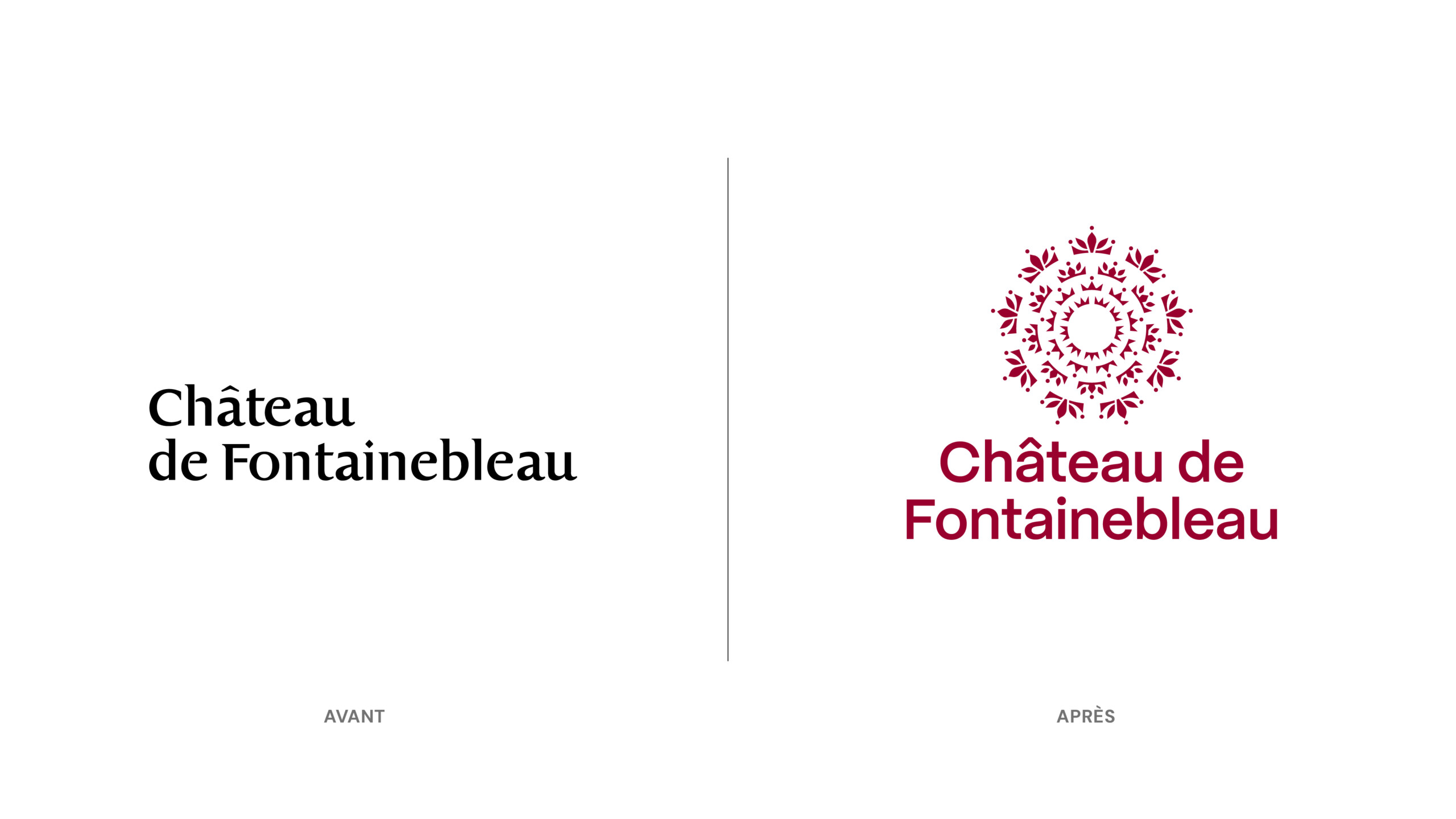
The Château de Fontainebleau asked us to refresh its visual identity. The existing logo felt outdated and lacked distinctiveness. Our challenge was to create an identity system that would be both timeless and contemporary, capable of expressing the richness of the Château’s eight centuries of history while making it resonate with today’s audiences.
How did the initial pitch/brainstorming phase go?
We framed the pitch around the idea of extraordinary continuity. Fontainebleau is the only French castle to have hosted 36 sovereigns — 34 kings and queens, 2 emperors, and even a pope. Rather than treating the Château as a static monument, we positioned it as a living story that has continually evolved through centuries. Our proposal was to translate this narrative into a coherent, contemporary identity system that would make its depth instantly legible.
What was the process behind ideating the concept?
Immersion was key. The only way to truly grasp the soul of a place like this is to go there and experience it firsthand. We walked through the vast gardens and forest, then moved inside through the grand halls and chambers, letting the weight of centuries speak to us. By slowing down and observing closely, details emerged: ornament, color, material, rhythm. These fragments slowly wove themselves into a coherent narrative.
What was the production process like?
Through iterative sketching and reduction, we distilled a wealth of historical content and a complex narrative into one legible emblem. The challenge was to strike the perfect balance between simplicity and detail — a symbol clear enough to work at small scales, but rich enough to embody centuries of meaning.
What was the biggest challenge during production? How did you overcome it?
The challenge was capturing eight centuries of history in a single symbol. The solution emerged in the seal of 36 crowns, a direct reference to the 36 sovereigns who shaped the Château. Paired with a contemporary and accessible typeface, the emblem creates a bridge between past and present.
What is one funny or notable thing that happened during production?
During our on-site visit, several team members were discovering Fontainebleau for the first time. Their sense of awe and wonder was contagious. That moment reminded us that the Château isn’t just a monument to study, it’s a place that must be experienced, and that feeling became a guiding thread for the project.
What’s the main message of this project and why does it matter?
History is not only something we inherit — it’s something we experience in the present. This matters because understanding the present is always enriched by an encounter with the past, with all its light and shadows.
How long did it take from inception to delivery?
3 months.
Can you describe the creative spark or inspiration behind the initial concept? Was there a specific moment or insight that ignited the idea?
Three threads converged: the succession of 36 sovereigns, embodied in a ring of crowns; the floral motif, a nod to the Château’s location in the heart of a vast and vibrant forest; and the desire to create an identity that feels multifaceted, like the Château itself. The spark was realizing these elements could be unified into one memorable seal — a symbol that holds together history, nature, and experience.
How did you ensure that the concept aligned with the brand’s values, goals, and target audience?
We worked closely with the Château’s conservators, living stewards of its history, whose expertise was essential in reinforcing and shaping the concept behind the project. Their insights grounded the project in historical accuracy while also encouraging us to think about future audiences.
Were there any alternative concepts or ideas considered during the ideation phase? If so, what led to the selection of the final concept?
Among the four routes presented, the chosen seal of 36 crowns quickly emerged as the strongest solution, achieving unanimous consensus. It was the clearest, most symbolic, and most distinctive expression of Fontainebleau’s unique story.
How did you ensure that the concept remained innovative and stood out in a crowded marketplace?
Benchmarking revealed that many cultural institutions rely on neutral wordmarks, limiting limited their identity to plain typefaces or building silhouettes. In contrast, the 36-crown seal provides Fontainebleau with a story-driven, highly distinctive symbol. It reads instantly, scales elegantly across mediums, and sets the Château apart with a mark that is both timeless and contemporary.
What do you hope it achieves for the brand?
We hope this new identity positions Fontainebleau as a must-visit destination for anyone spending time in Paris.
News
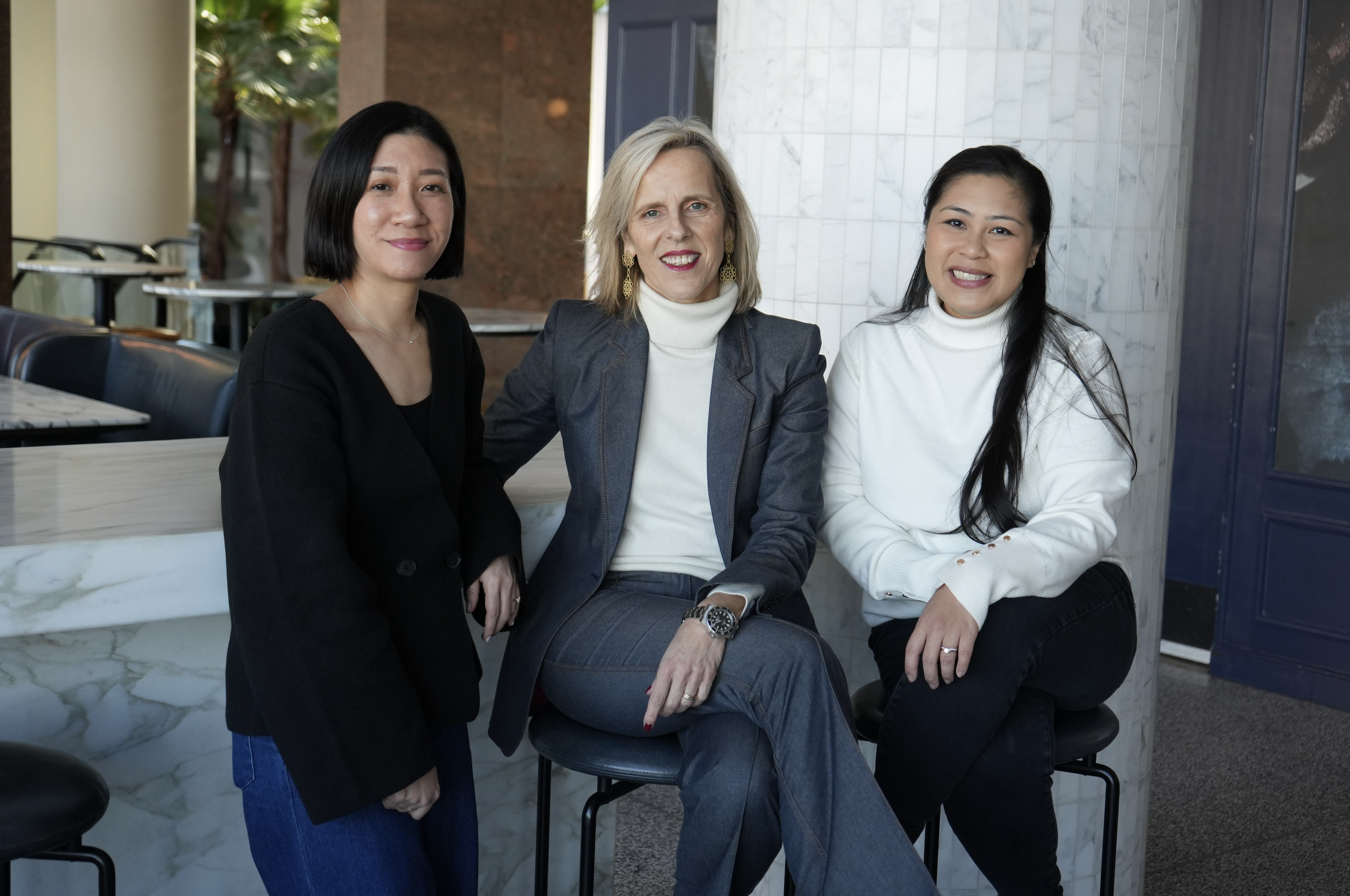
Hershey’s win strengthens Lonsdale’s US momentum
Following the recent Hershey’s win, Lonsdale is strengthening its momentum in the United States — a key step in the agency’s long-term international trajectory. From New York, Michelle Mak, Creative Director, and Steffie Palang, Account Lead, a...
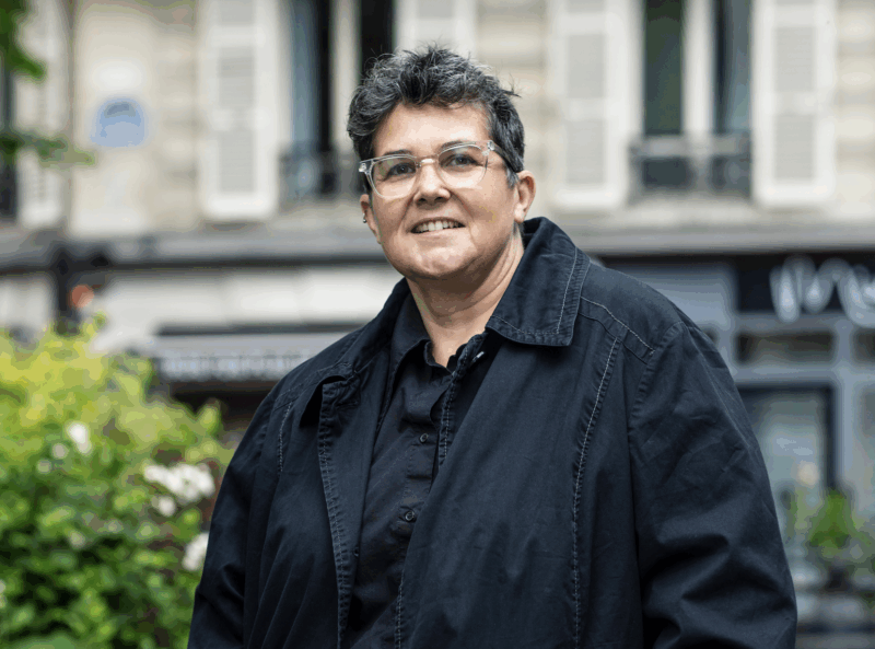
Creative Bloq │ Muriel Schildknecht │ AI Can’t Replicate Empathy, and That’s Why It Won’t Win
Muriel’s opinion piece was originally published on Creative Bloq. AI can’t replicate empathy, and that’s why it won’t win It should push us to be more human. As creatives, we’re navigating an industry transformed. AI is no l...

Brandingmag │ Félix Mathieu │ Branded Sentiments: FRUST-LUST — The pleasure of never getting it
What if frustration became… a brand pleasure? In his latest Branded Sentiments column for Brandingmag, our Chief Strategy Officer Félix Mathieu explores a strangely universal emotion: the deliberate, delicious tension of wanting something you may ...