Redesigning an Icon for the Next Generation of Care
A global brand renovation reaffirming Dove’s leadership in superior body care.
After more than 18 years without a significant change, the iconic Dove Body Wash bottle had become a familiar figure — but also a stagnant one. Frequently mimicked by value brands and increasingly seen as outdated by consumers, its form no longer reflected Dove’s modern values or market leadership. It was time to reimagine a classic, not by erasing its legacy, but by evolving it to remain relevant, desirable, and future-ready.
Unilever entrusted forceMajeure / Lonsdale with a strategic and creative challenge: to create the next generation of Dove Body Wash, with a new structural and graphic identity that would capture Dove’s essence while meeting the expectations of today’s beauty and care consumers — combining empathy, efficacy, and sustainability in a single gesture.
A new silhouette for the next 18 years
The redesigned bottle is more than a shape: it’s a bold yet respectful evolution that brings together brand equity and innovation.
The objectives were clear:
-
Reassert Dove’s distinctiveness in a saturated and imitative category
-
Elevate premium and beauty cues, blending care and sophistication
-
Deliver on sustainability promises with a 100% post-consumer recycled (PCR) plastic bottle and a 9–10% plastic reduction per unit
The result is a bottle that feels fluid, balanced, and human with a redesigned, wider cap for easier opening and added stability– perfect for inverted storing as it nears empty, to get every last drop.
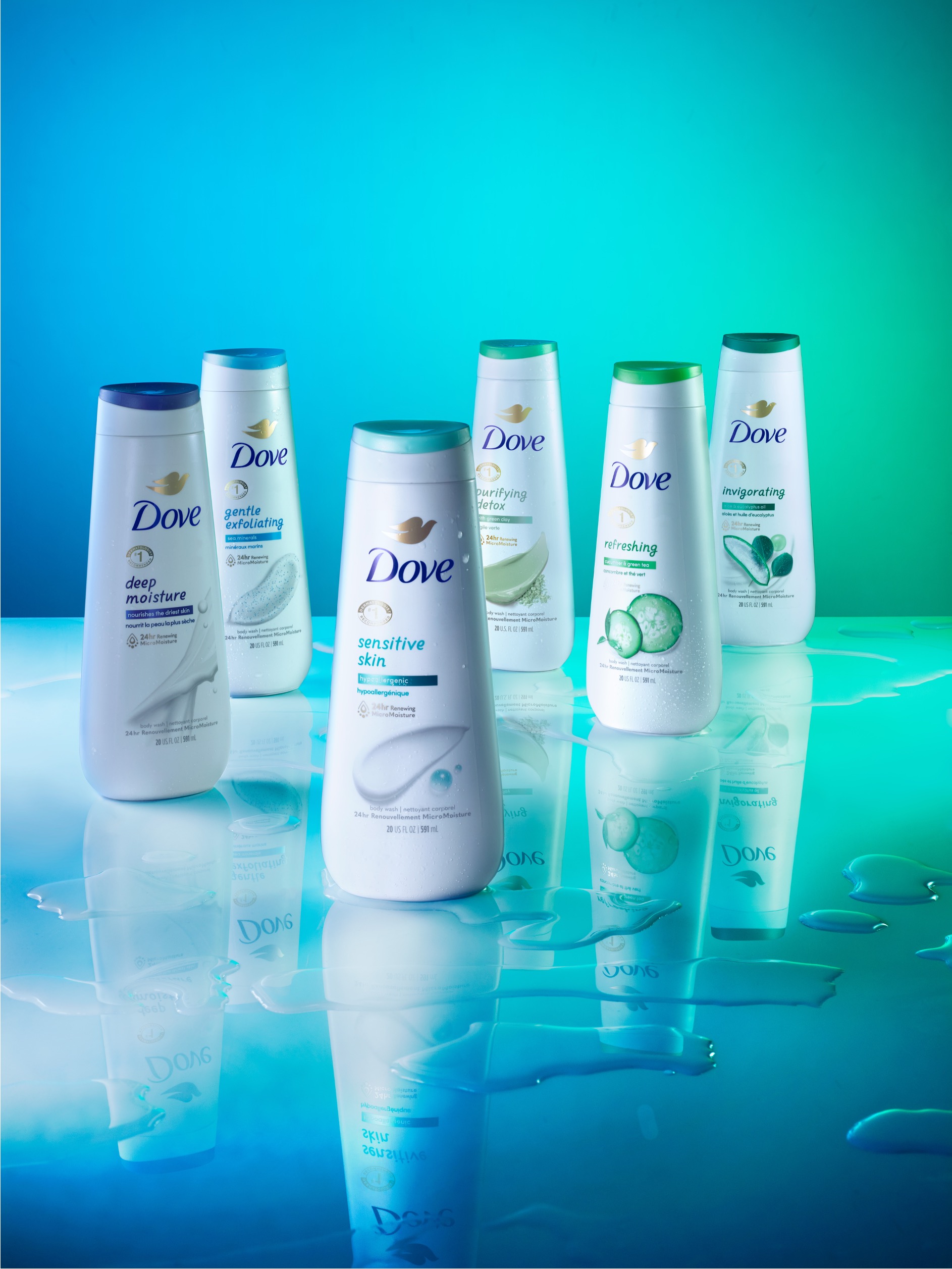
A graphic identity that feels sensorial, modern, and premium
Beyond structure, the transformation extended to a complete graphic redesign, capturing the spirit of the new Dove:
-
A refreshed logotype, with the Dove bird icon elevated for greater clarity and prominence
-
A custom typeface bringing warmth, personality, and premium feel to every variant
-
A new photographic art direction, visually expressing the sensorial richness of ingredients through natural, premium, and indulgent imagery
-
A clear, bilingual layout system harmonizing global packs and making benefits instantly legible
This new design language expresses superior nourishment and care, while seamlessly aligning with Dove’s values — efficacy, naturality, and inclusive beauty.
Selected work
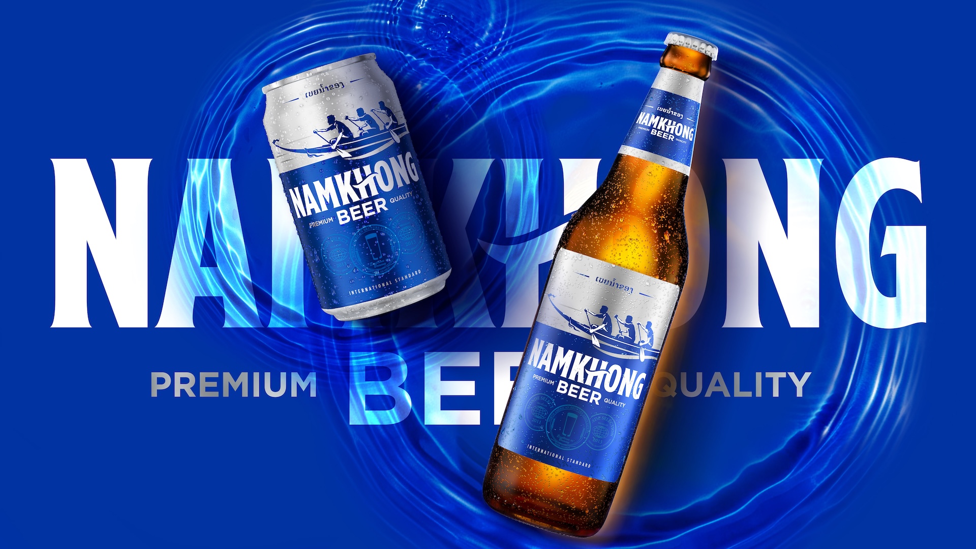
Namkhong Beer
View case study

Renault
View case study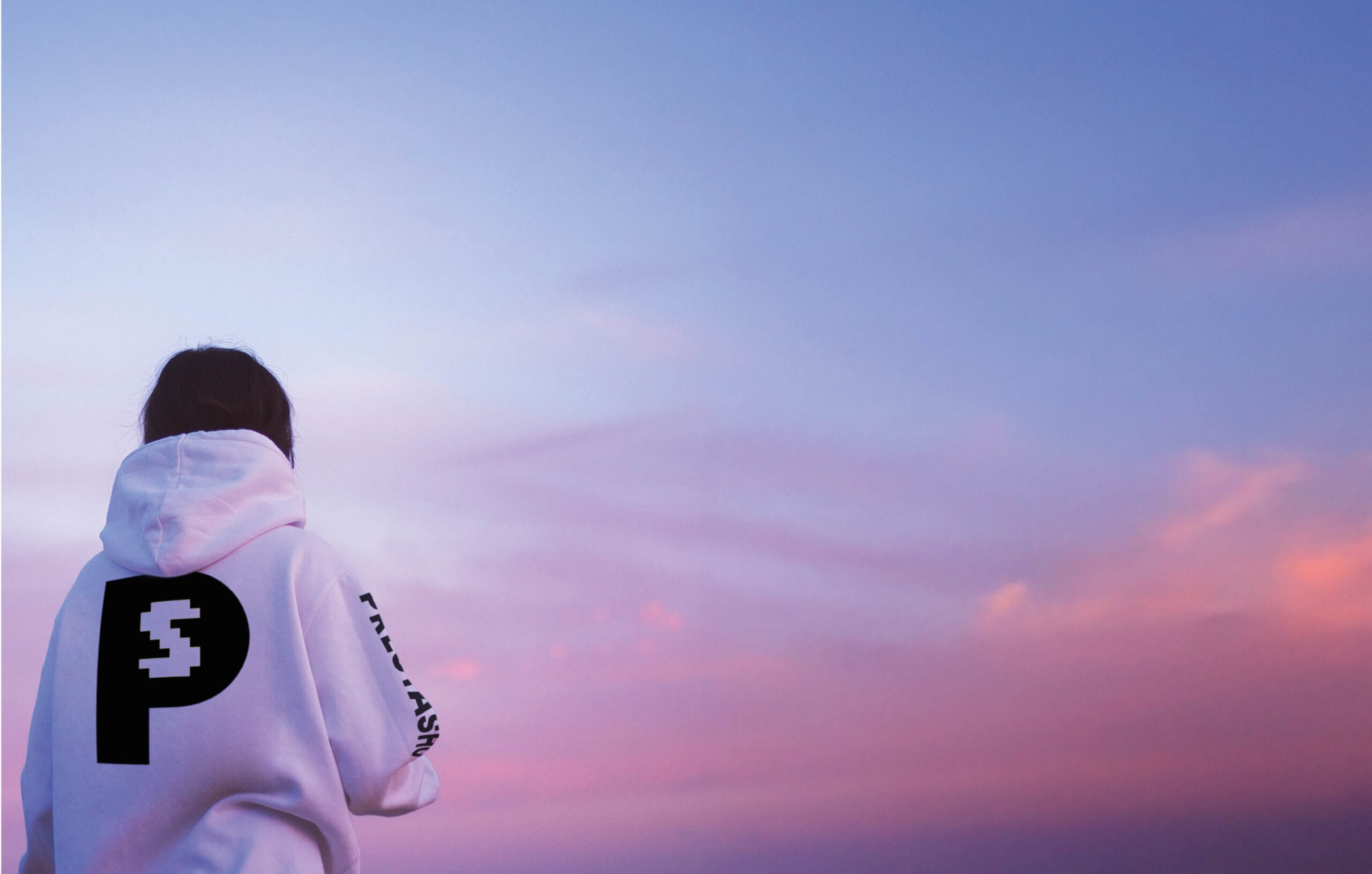

PrestaShop
View case study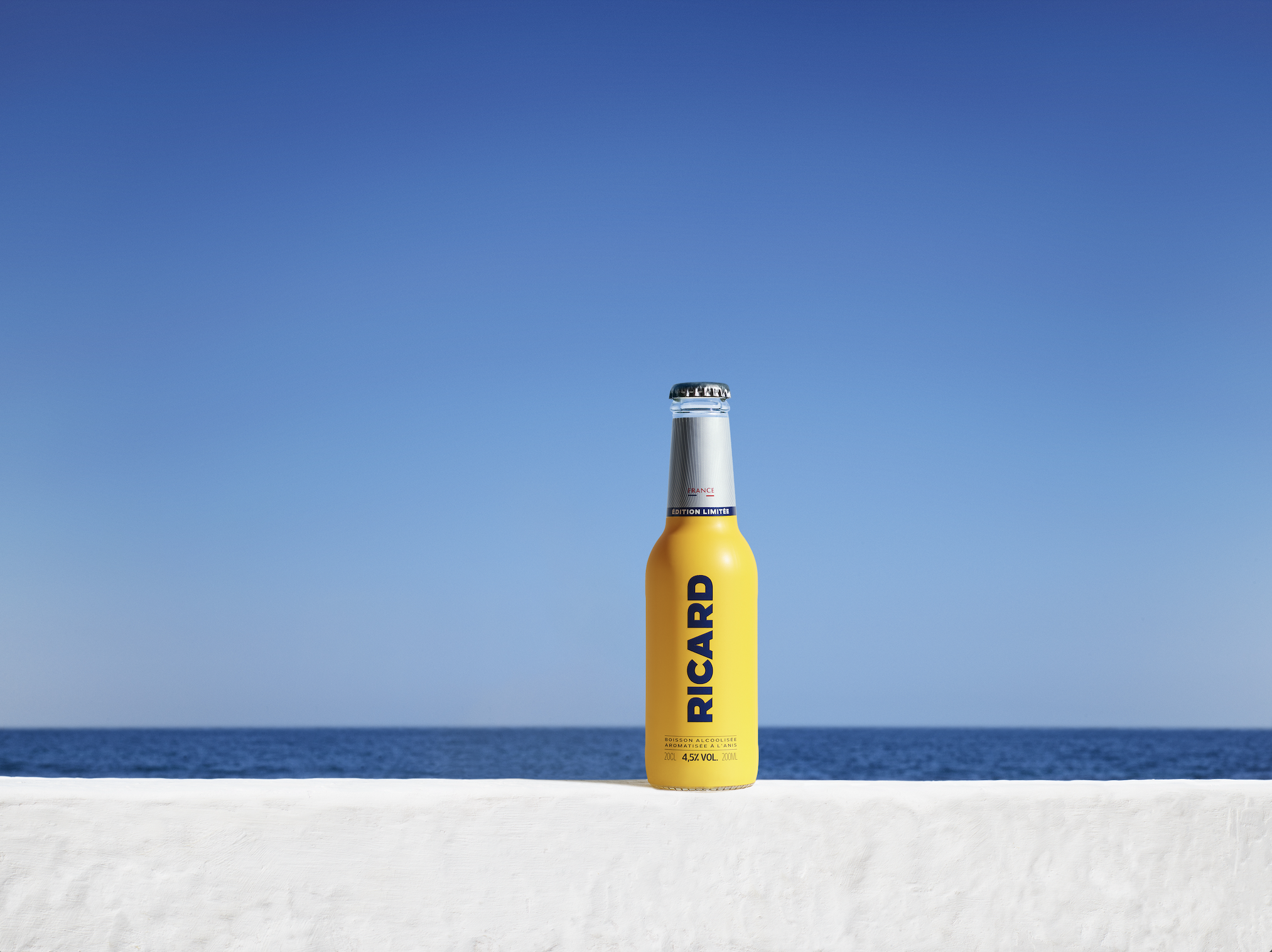

Ricard
View case study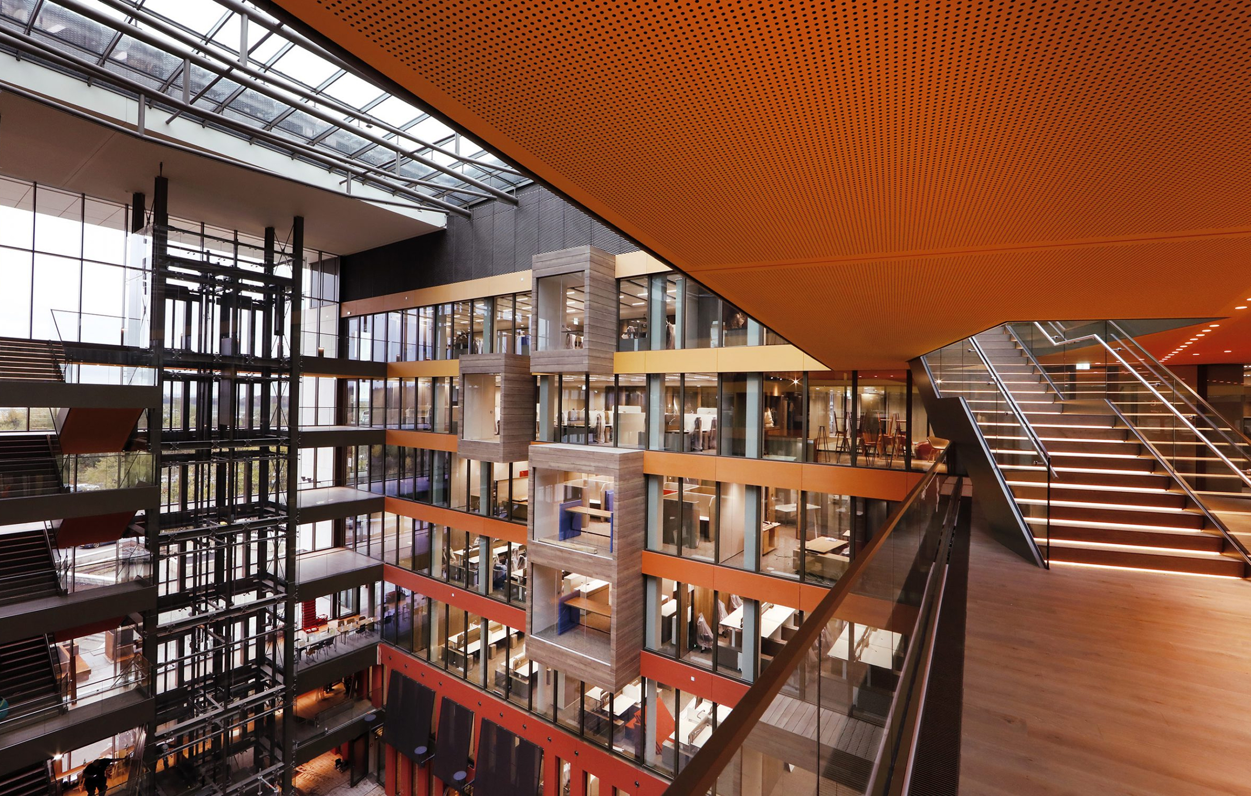

Ferrero
View case study

Sanofi
View case study

Clarins
View case study

Rexel
View case study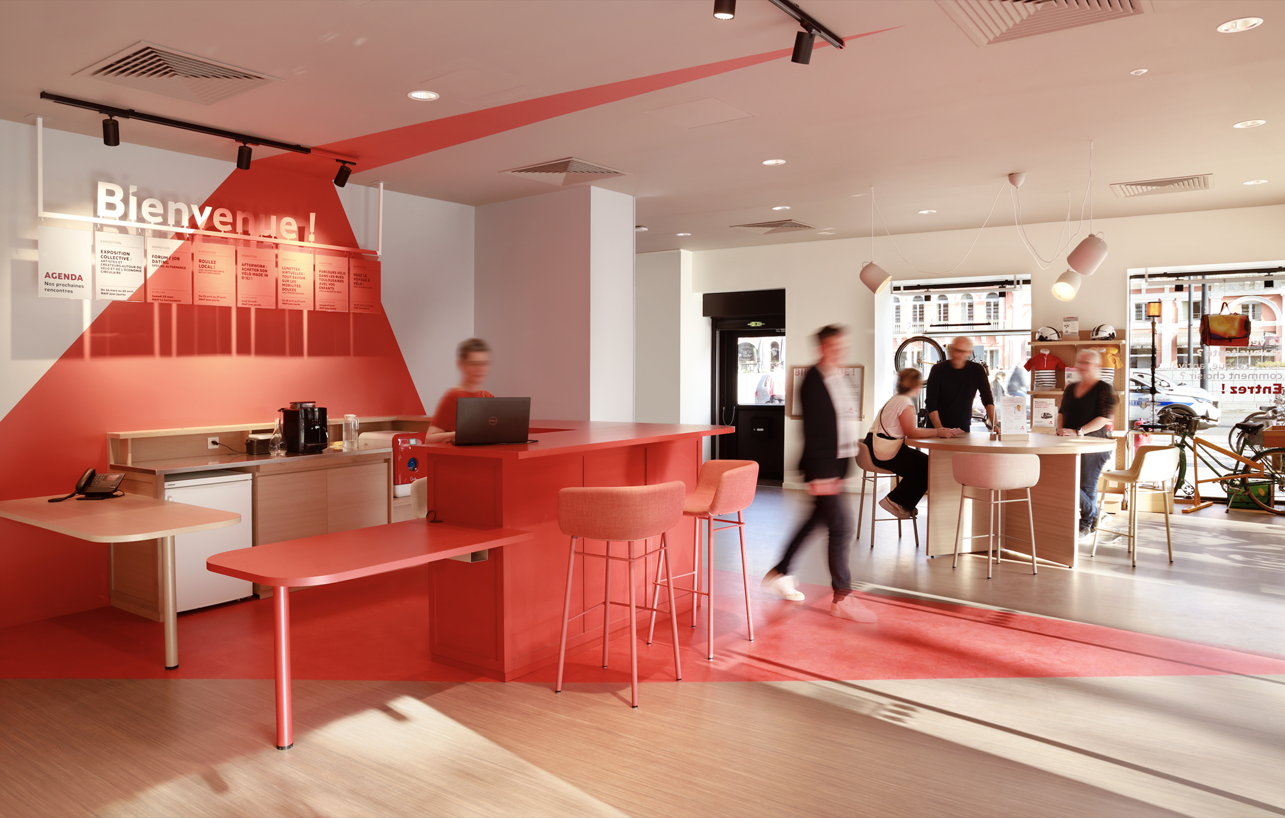

MAIF
View case study

Santé Verte
View case study

Maggi
View case study
Namkhong Beer
View case study
Renault
View case study
PrestaShop
View case study
Ricard
View case study
Ferrero
View case study
Sanofi
View case study
Clarins
View case study
Rexel
View case study
MAIF
View case study
Santé Verte
View case study
Maggi
View case study
Renault
View case study
PrestaShop
View case study
Ricard
View case study
Ferrero
View case study
Sanofi
View case study
Clarins
View case study
Rexel
View case study
MAIF
View case study
Santé Verte
View case study
Maggi
View case study
Namkhong Beer
View case study
Renault
View case study
PrestaShop
View case study
Ricard
View case study
Ferrero
View case study
Sanofi
View case study
Clarins
View case study
Rexel
View case study
MAIF
View case study
Santé Verte
View case study
Maggi
View case study
Namkhong Beer
View case study-
Namkhong Beer
View case study -
Renault
View case study -
PrestaShop
View case study -
Ricard
View case study -
Ferrero
View case study -
Sanofi
View case study -
Clarins
View case study -
Rexel
View case study -
MAIF
View case study -
Santé Verte
View case study -
Maggi
View case study -
Namkhong Beer
View case study -
Renault
View case study -
PrestaShop
View case study -
Ricard
View case study -
Ferrero
View case study -
Sanofi
View case study -
Clarins
View case study -
Rexel
View case study -
MAIF
View case study -
Santé Verte
View case study -
Maggi
View case study