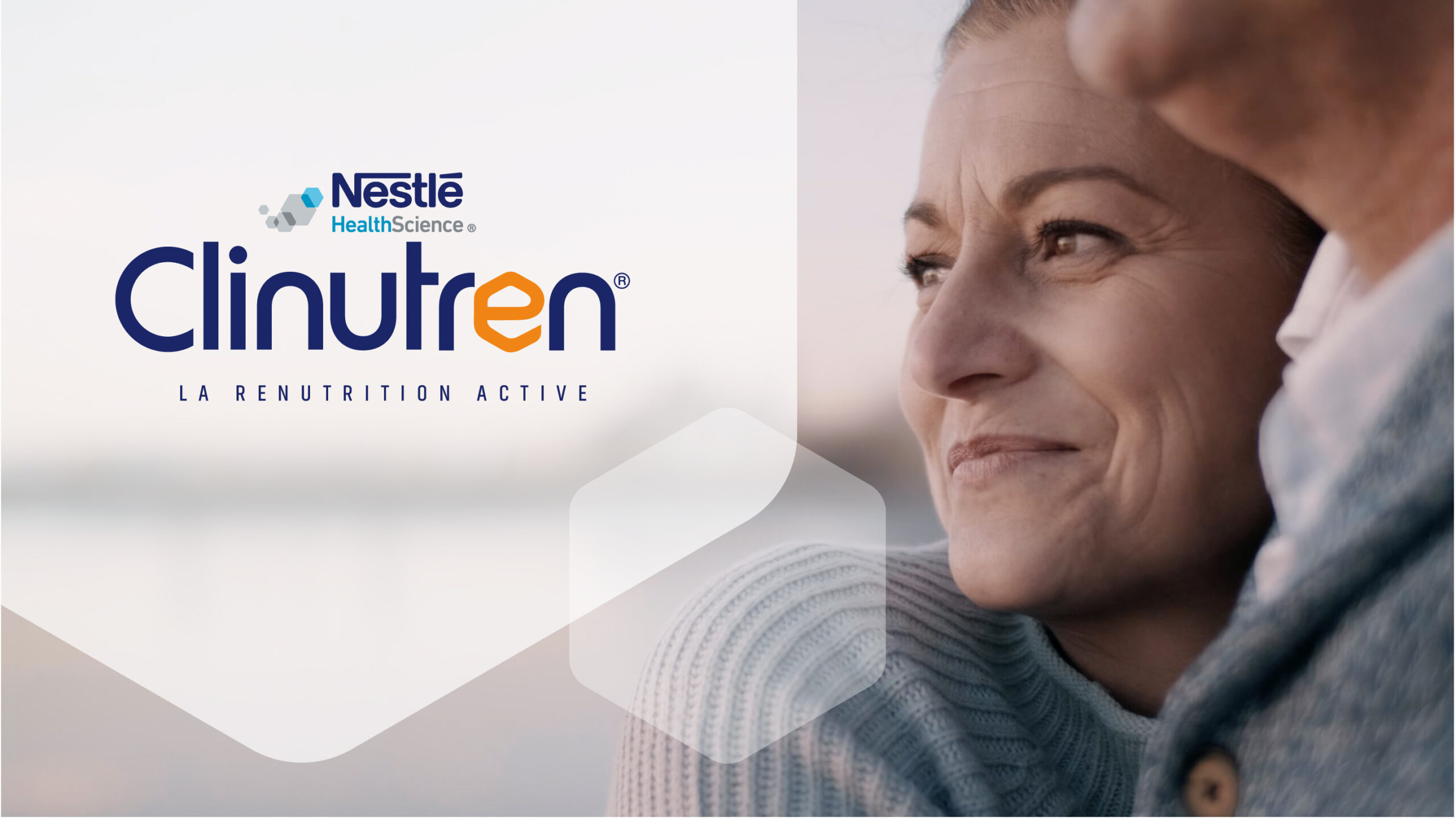
A Patient-Centric Strategy to Rethink Medical Nutrition
A pioneer in medical nutrition, Nestlé Health Science turned to Lonsdale to redefine its brand strategy and product portfolio in a complex market shaped by prescription, clinical protocols, and diverse audiences—from patients to caregivers and healthcare professionals.
Through a Design Thinking approach, Lonsdale uncovered a core issue: the category and product offer were poorly understood. The solution? Refocus on the patient to improve therapeutic adherence.
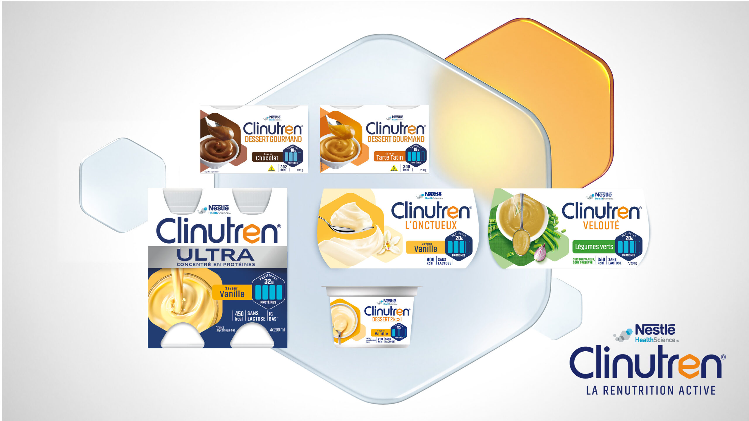
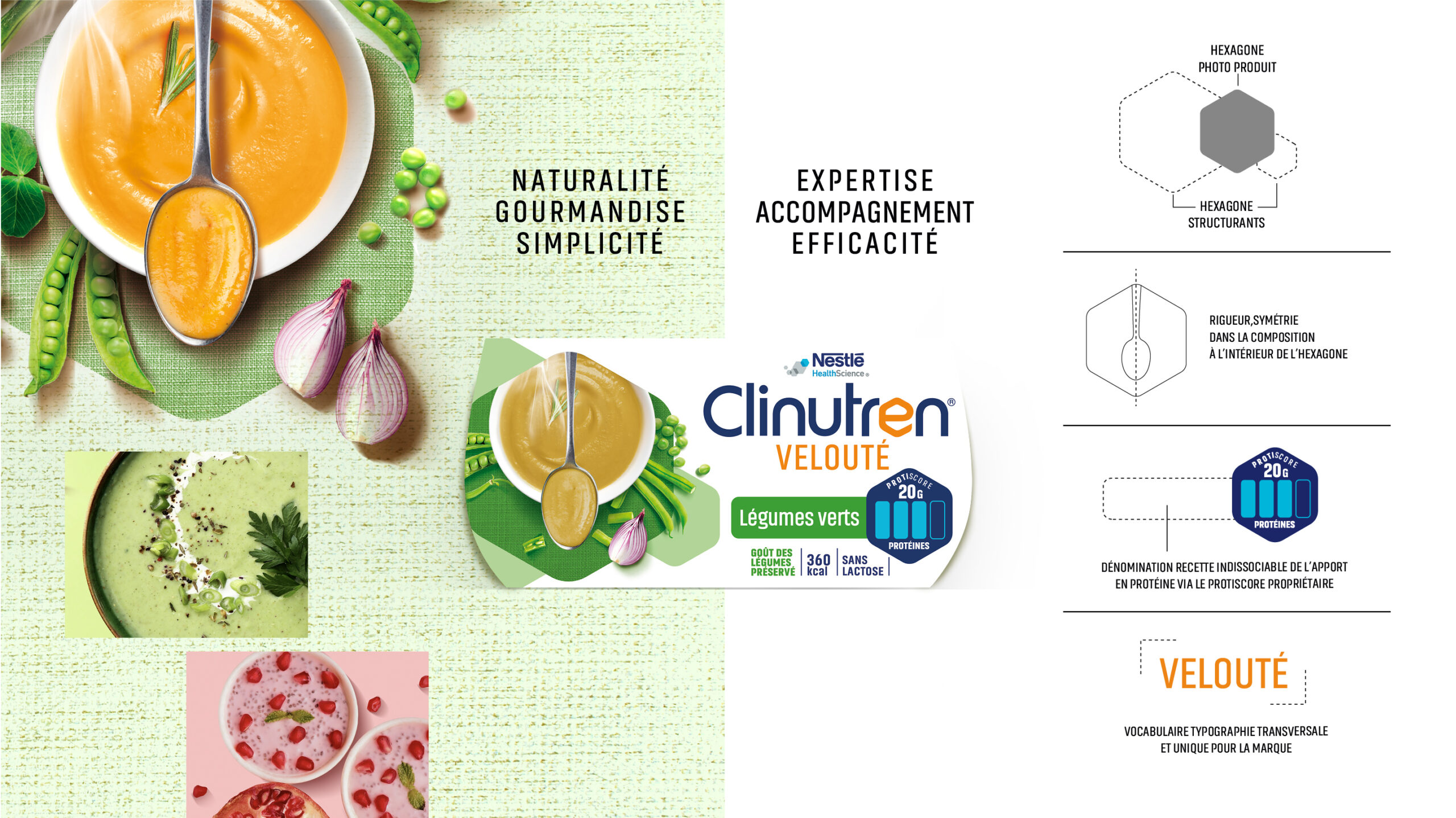
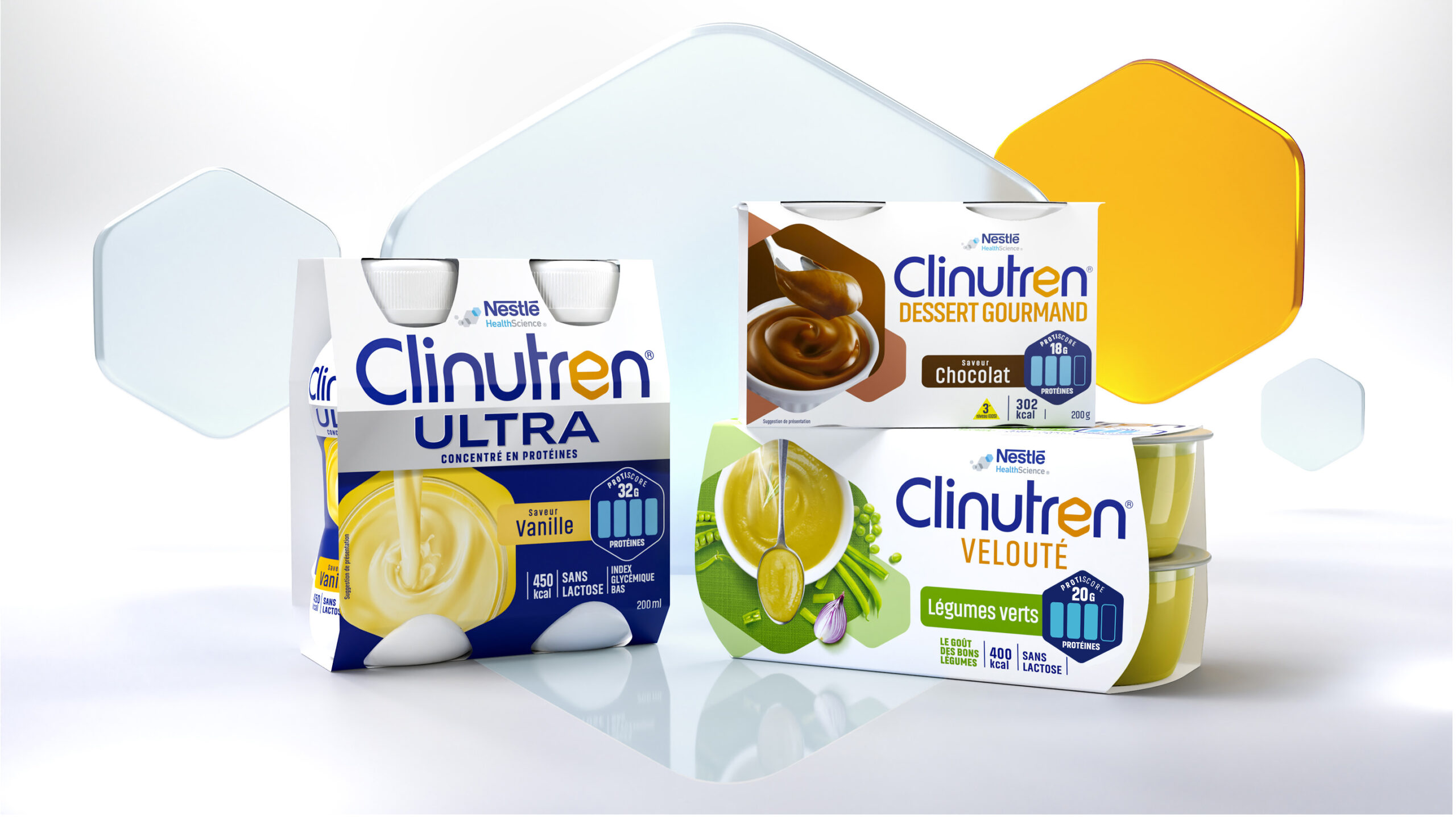
The result was the Protiscore: a proprietary and patented tool that clearly communicates protein content on each pack. Intuitive and informative, it helps guide patients, caregivers, and medical staff alike, becoming a central navigation aidin both the range and the treatment journey.
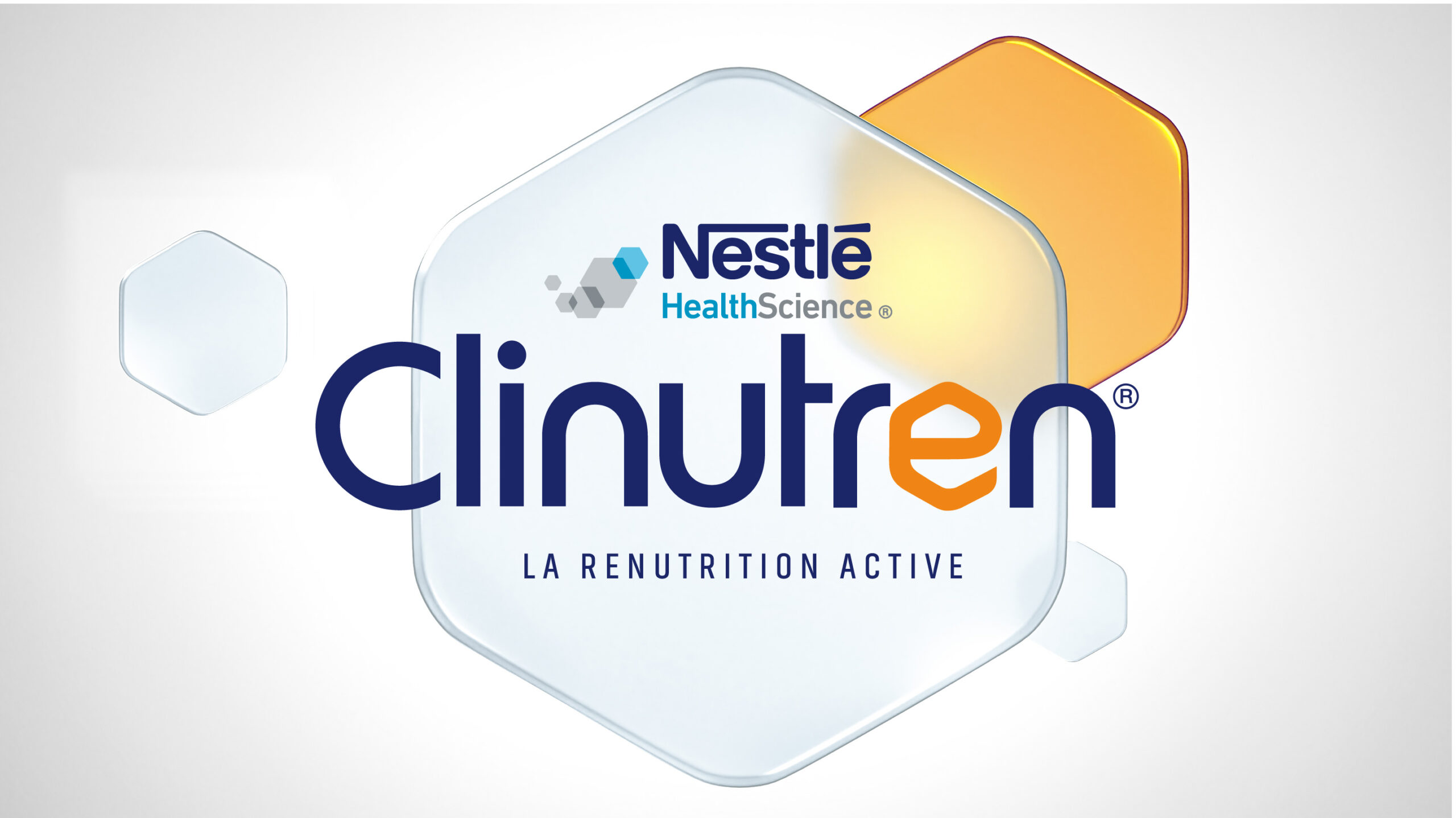
The brand architecture was also redefined: Clinutren becomes the umbrella brand, supported by a more emotional positioning, a new identity, and a clear promise—Active Renutrition.
The redesigned packaging combines clarity, structure, and warmth, emphasizing both ingredient appeal and clinical expertise, reinforcing understanding, trust, and compliance throughout the patient journey.
Selected work
Dove
View case study

Renault
View case study

PrestaShop
View case study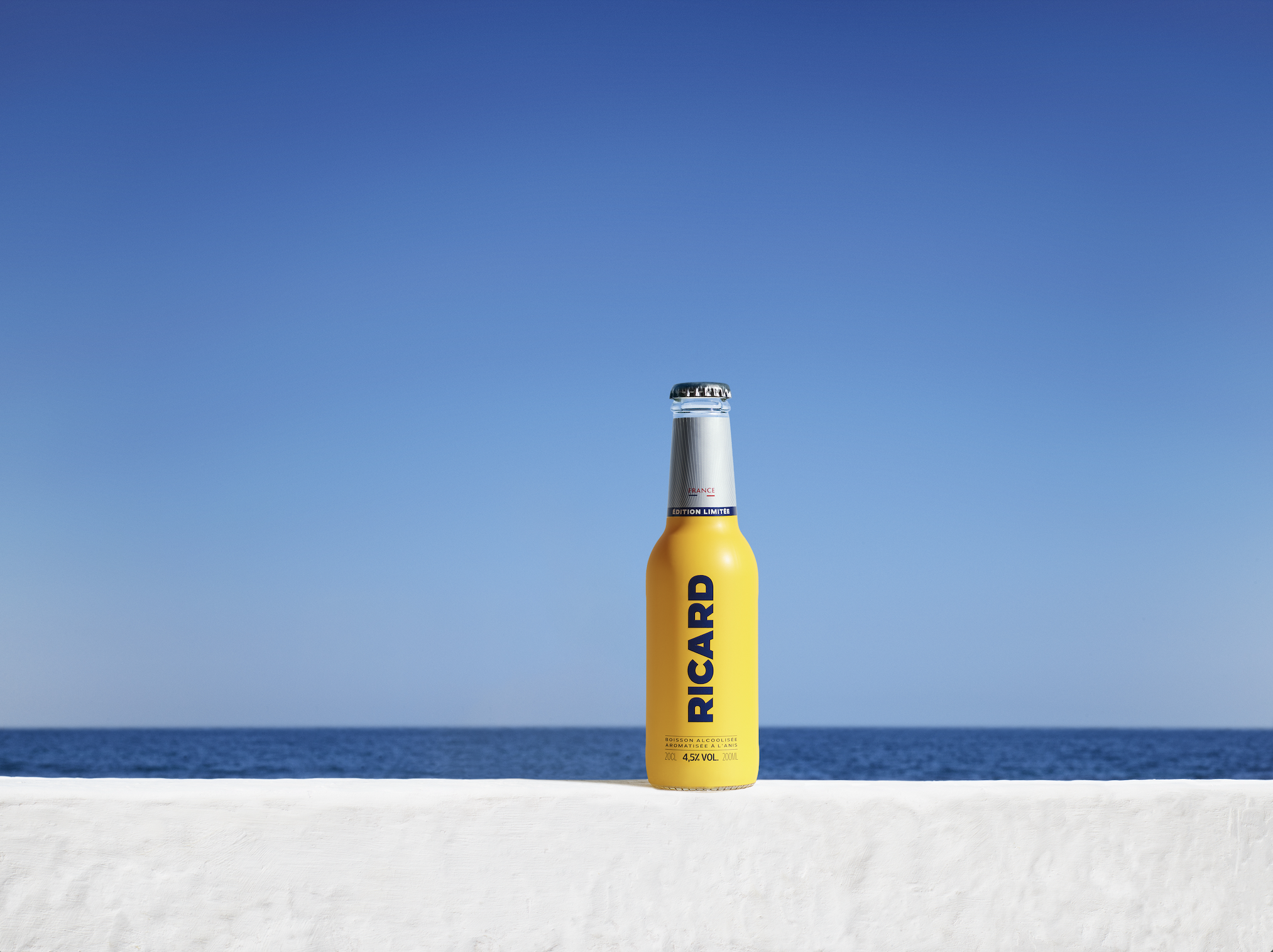

Ricard
View case study

Ferrero
View case study

Sanofi
View case study

Clarins
View case study

Rexel
View case study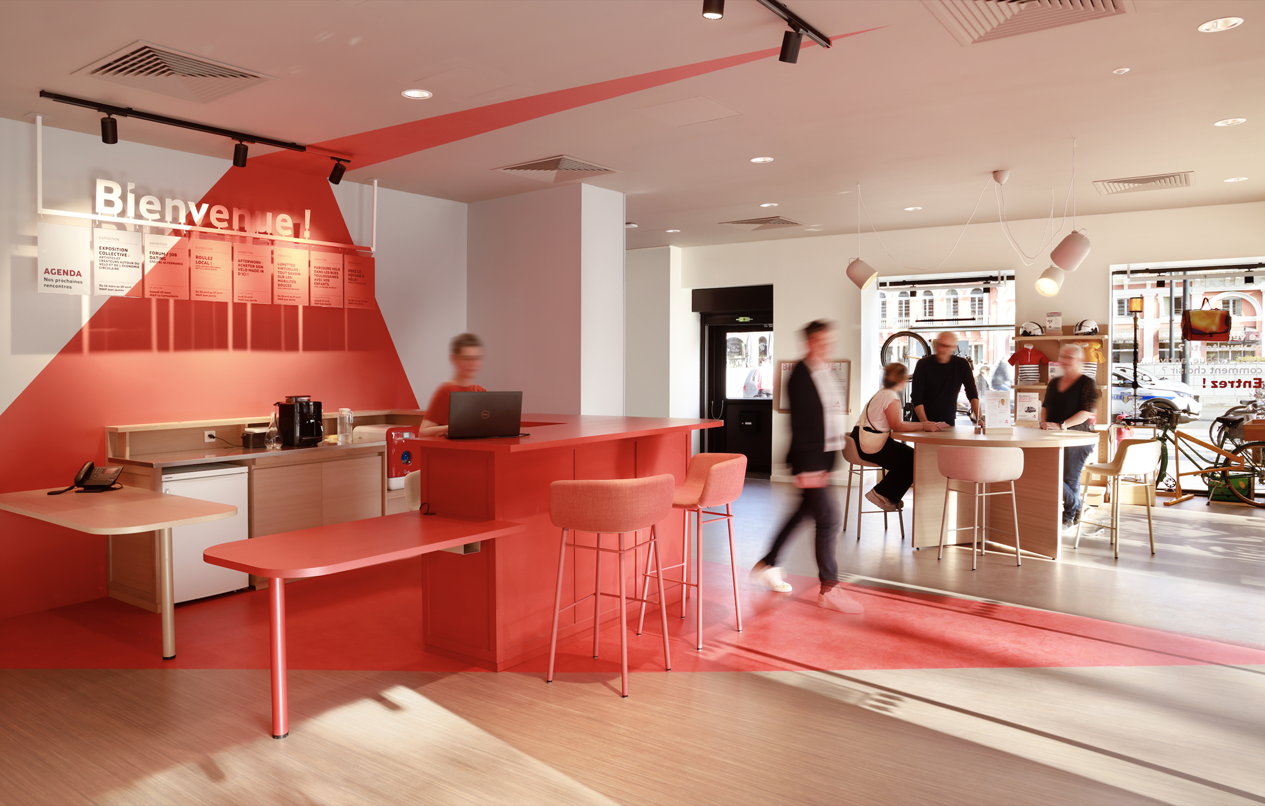

MAIF
View case study

Santé Verte
View case study

Maggi
View case study
Tiger Beer (Heineken Group)
View case studyDove
View case study
Renault
View case study
PrestaShop
View case study
Ricard
View case study
Ferrero
View case study
Sanofi
View case study
Clarins
View case study
Rexel
View case study
MAIF
View case study
Santé Verte
View case study
Maggi
View case study
Tiger Beer (Heineken Group)
View case study
Renault
View case study
PrestaShop
View case study
Ricard
View case study
Ferrero
View case study
Sanofi
View case study
Clarins
View case study
Rexel
View case study
MAIF
View case study
Santé Verte
View case study
Maggi
View case study
Tiger Beer (Heineken Group)
View case studyDove
View case study
Renault
View case study
PrestaShop
View case study
Ricard
View case study
Ferrero
View case study
Sanofi
View case study
Clarins
View case study
Rexel
View case study
MAIF
View case study
Santé Verte
View case study
Maggi
View case study
Tiger Beer (Heineken Group)
View case studyDove
View case study-
Dove
View case study -
Renault
View case study -
PrestaShop
View case study -
Ricard
View case study -
Ferrero
View case study -
Sanofi
View case study -
Clarins
View case study -
Rexel
View case study -
MAIF
View case study -
Santé Verte
View case study -
Maggi
View case study -
Tiger Beer (Heineken Group)
View case study -
Dove
View case study -
Renault
View case study -
PrestaShop
View case study -
Ricard
View case study -
Ferrero
View case study -
Sanofi
View case study -
Clarins
View case study -
Rexel
View case study -
MAIF
View case study -
Santé Verte
View case study -
Maggi
View case study -
Tiger Beer (Heineken Group)
View case study