A Bold Visual Identity to Reflect a Science-Driven Approach to Natural Pet Nutrition
In a fast-evolving pet food market increasingly shaped by naturalness, safety, and a new definition of premium, Purina One sought to anticipate change and elevate its brand positioning across key European markets: France, UK, Germany, Italy, Spain, and Russia.
Lonsdale was tasked with reconciling the brand’s scientific heritage—a strong purchase driver—with the growing consumer demand for naturalness. After multiple rounds of consumer testing, we developed a new visual identity system built around a bold, charismatic brand icon inspired by the Maine Coon—symbolizing intelligence, poise, and confidence.
The new identity retains strong brand recognition while introducing more emotional storytelling, premium codes, and a cleaner, more modern design, all tailored to local constraints (formats, languages, strategies). Comprehensive brand guidelines ensure consistency and ease of rollout for local agencies.
In parallel, we adapted these new assets to Vital Balance, Purina’s premium brand for the Swiss market. By adjusting shared visual cues, we maintained brand coherence across portfolios while honoring each brand’s distinct personality.
An ambitious transformation to express Purina’s unique vision of expert-led natural nutrition.
Selected work
Dove
View case study

Renault
View case study

PrestaShop
View case study

Ricard
View case study

Ferrero
View case study

Sanofi
View case study

Clarins
View case study

Rexel
View case study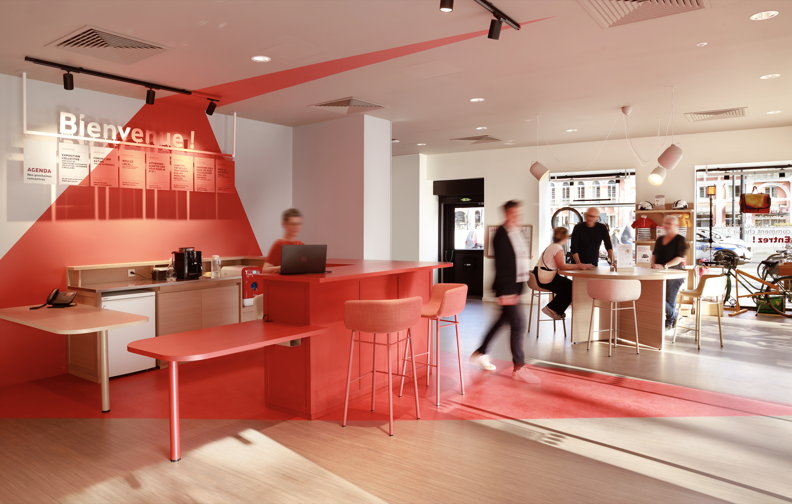

MAIF
View case study

Santé Verte
View case study

Maggi
View case study
Tiger Beer (Heineken Group)
View case studyDove
View case study
Renault
View case study
PrestaShop
View case study
Ricard
View case study
Ferrero
View case study
Sanofi
View case study
Clarins
View case study
Rexel
View case study
MAIF
View case study
Santé Verte
View case study
Maggi
View case study
Tiger Beer (Heineken Group)
View case study
Renault
View case study
PrestaShop
View case study
Ricard
View case study
Ferrero
View case study
Sanofi
View case study
Clarins
View case study
Rexel
View case study
MAIF
View case study
Santé Verte
View case study
Maggi
View case study
Tiger Beer (Heineken Group)
View case studyDove
View case study
Renault
View case study
PrestaShop
View case study
Ricard
View case study
Ferrero
View case study
Sanofi
View case study
Clarins
View case study
Rexel
View case study
MAIF
View case study
Santé Verte
View case study
Maggi
View case study
Tiger Beer (Heineken Group)
View case studyDove
View case study-
Dove
View case study -
Renault
View case study -
PrestaShop
View case study -
Ricard
View case study -
Ferrero
View case study -
Sanofi
View case study -
Clarins
View case study -
Rexel
View case study -
MAIF
View case study -
Santé Verte
View case study -
Maggi
View case study -
Tiger Beer (Heineken Group)
View case study -
Dove
View case study -
Renault
View case study -
PrestaShop
View case study -
Ricard
View case study -
Ferrero
View case study -
Sanofi
View case study -
Clarins
View case study -
Rexel
View case study -
MAIF
View case study -
Santé Verte
View case study -
Maggi
View case study -
Tiger Beer (Heineken Group)
View case study