Reinventing the commercial spirit
Architectural Design
Brand Territory
Customer Journey
Visual Identity
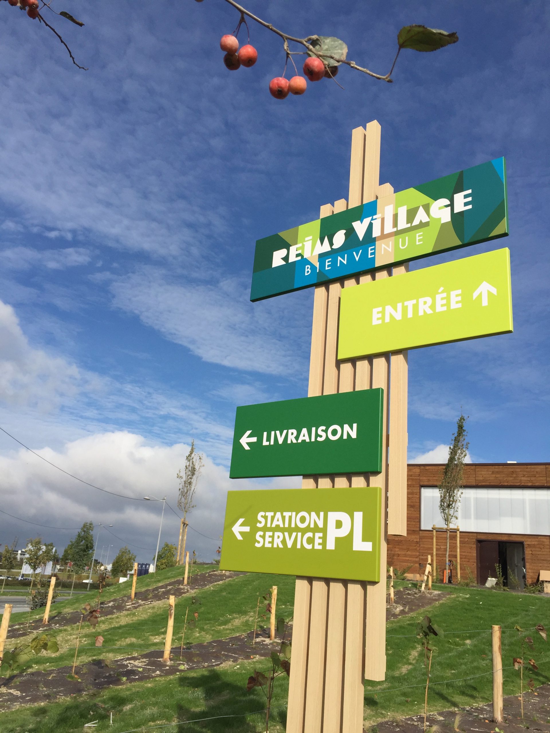
In a highly competitive market, the new Reims Village center stands out with its human-scale format, offering a faster, more convenient, and higher-quality shopping experience. Lonsdale developed the site’s entire identity—6,500 m² of retail space, one year of construction, 14,000 weekly customers—positioning the brand within a dynamic of innovation and local connection.
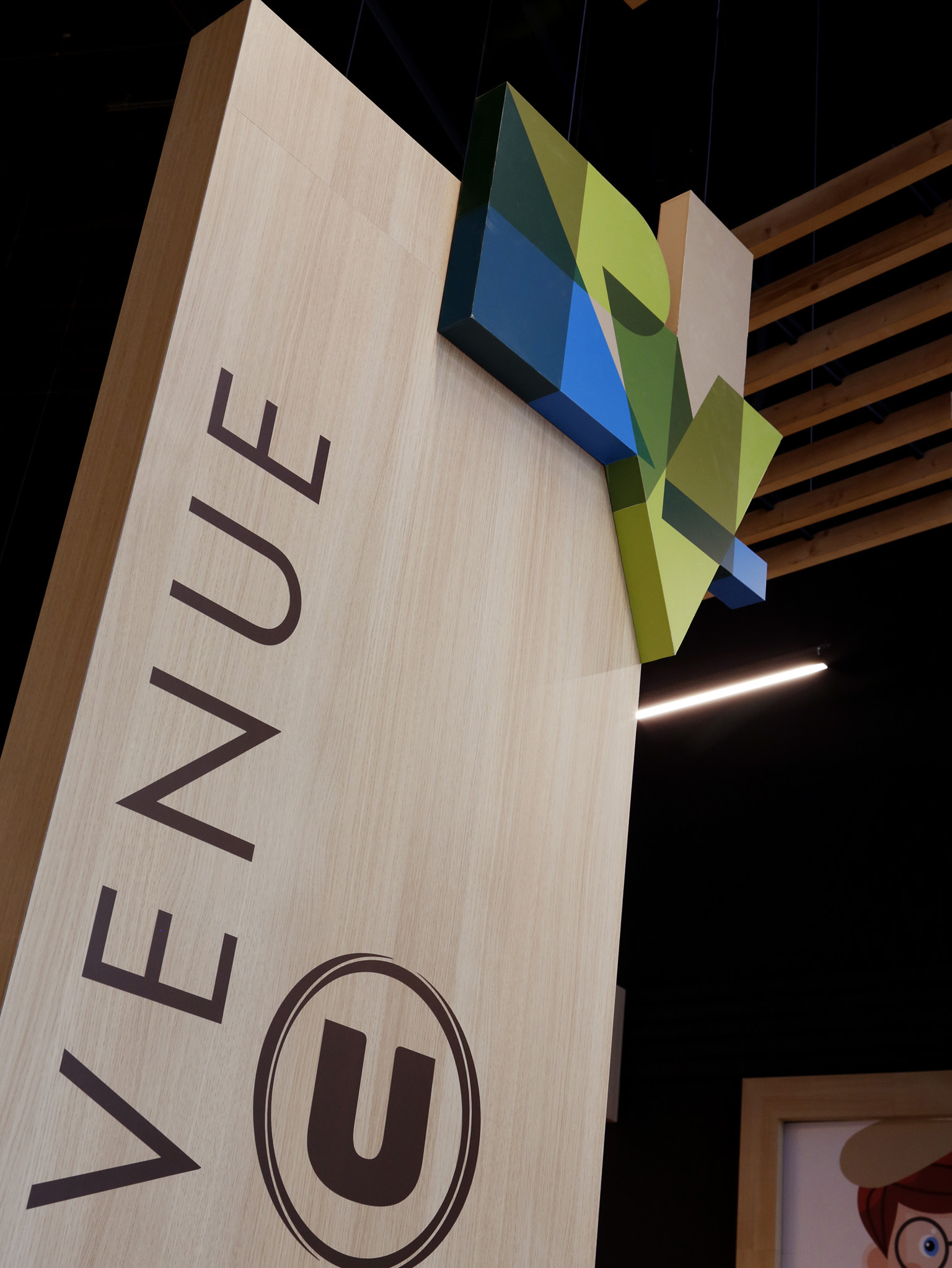
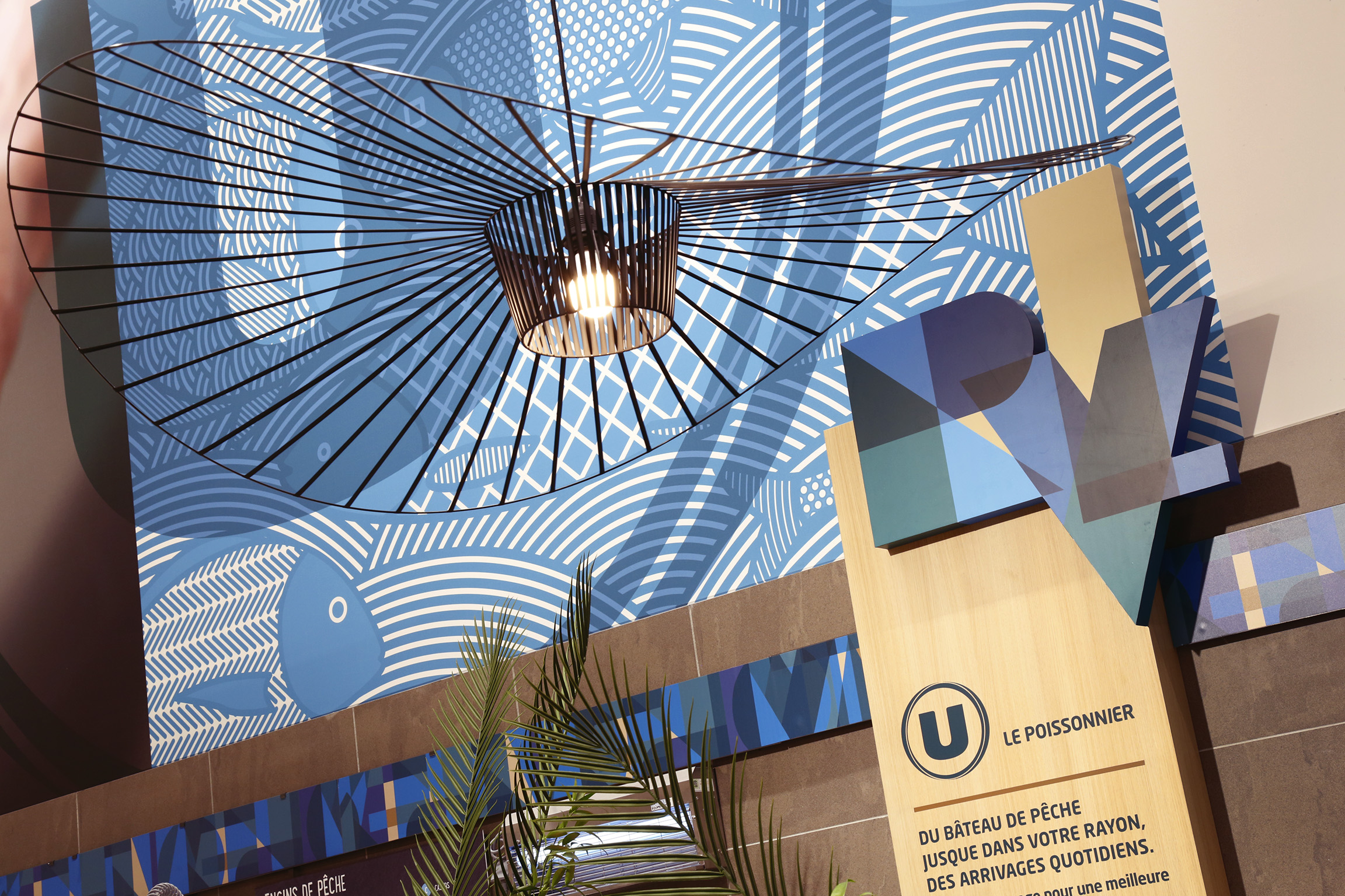
Inspired by nature and regional heritage, the visual identity features a palette of chardonnay green, chalk beige, and royal blue, expressed through a timeless and artistic graphic style. The customer journey emphasizes short supply chains, traditional trades, and local expertise.
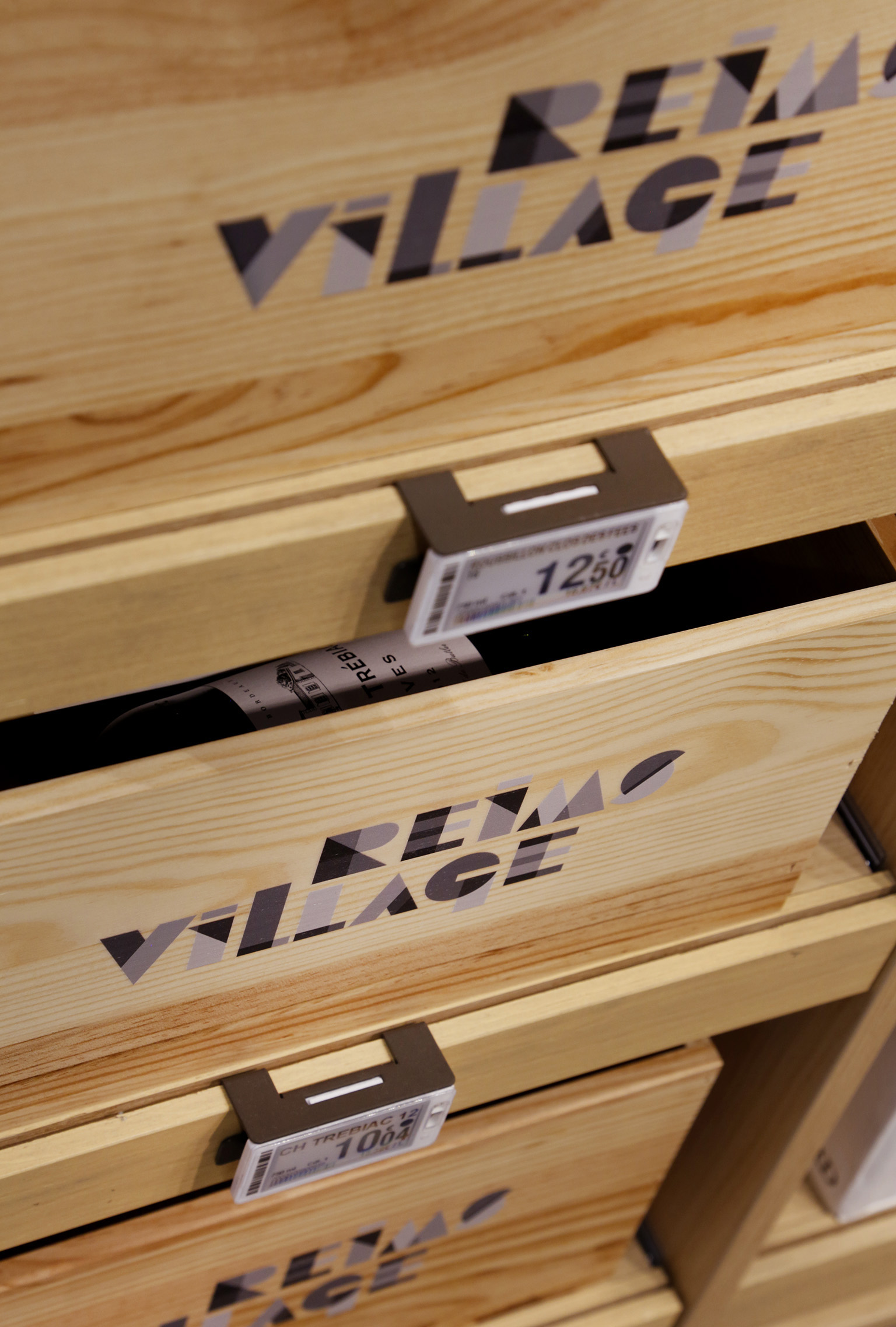
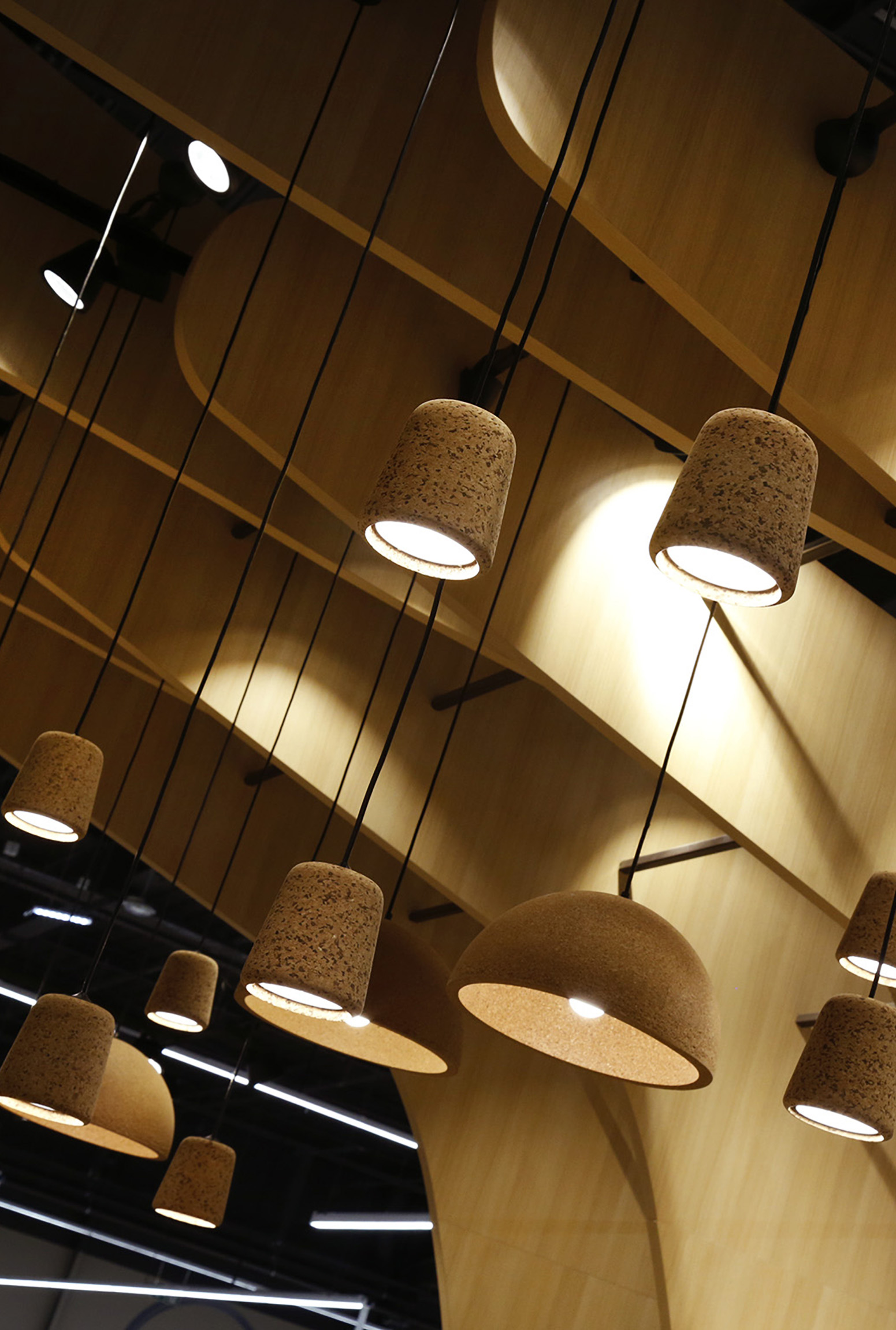
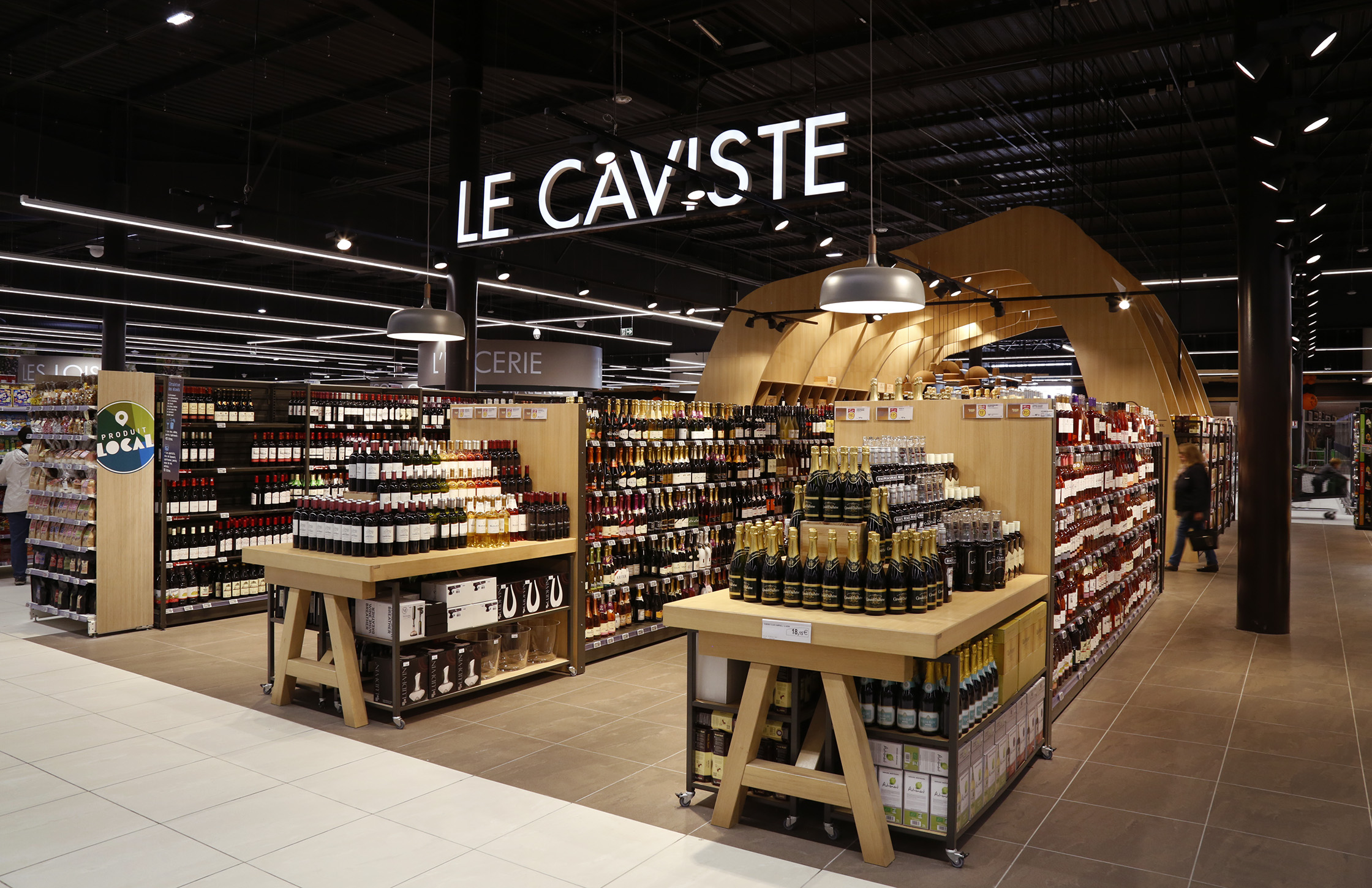
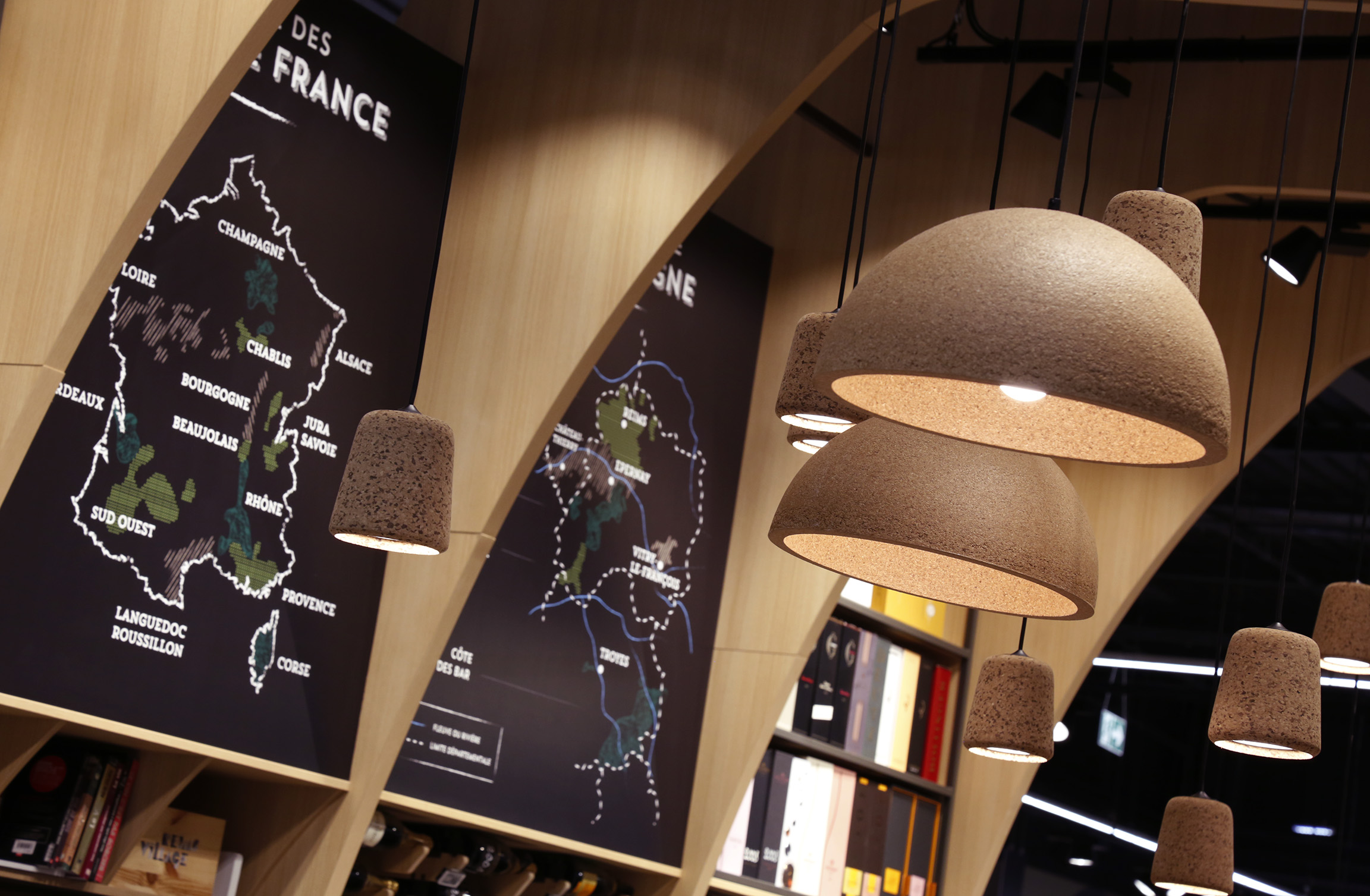
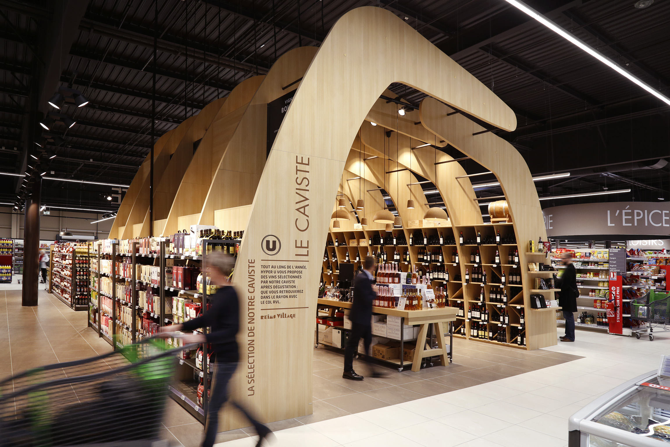
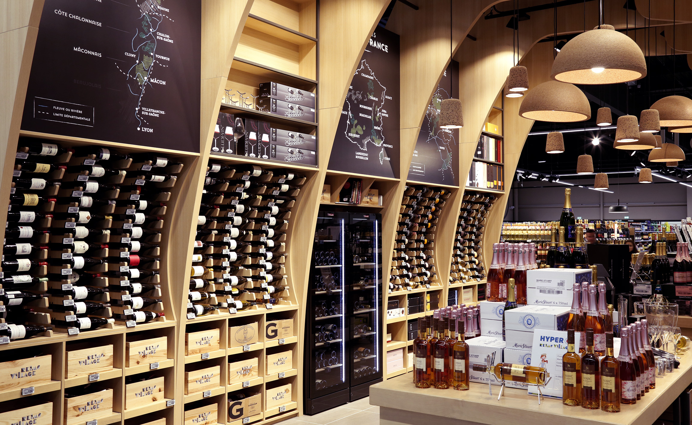
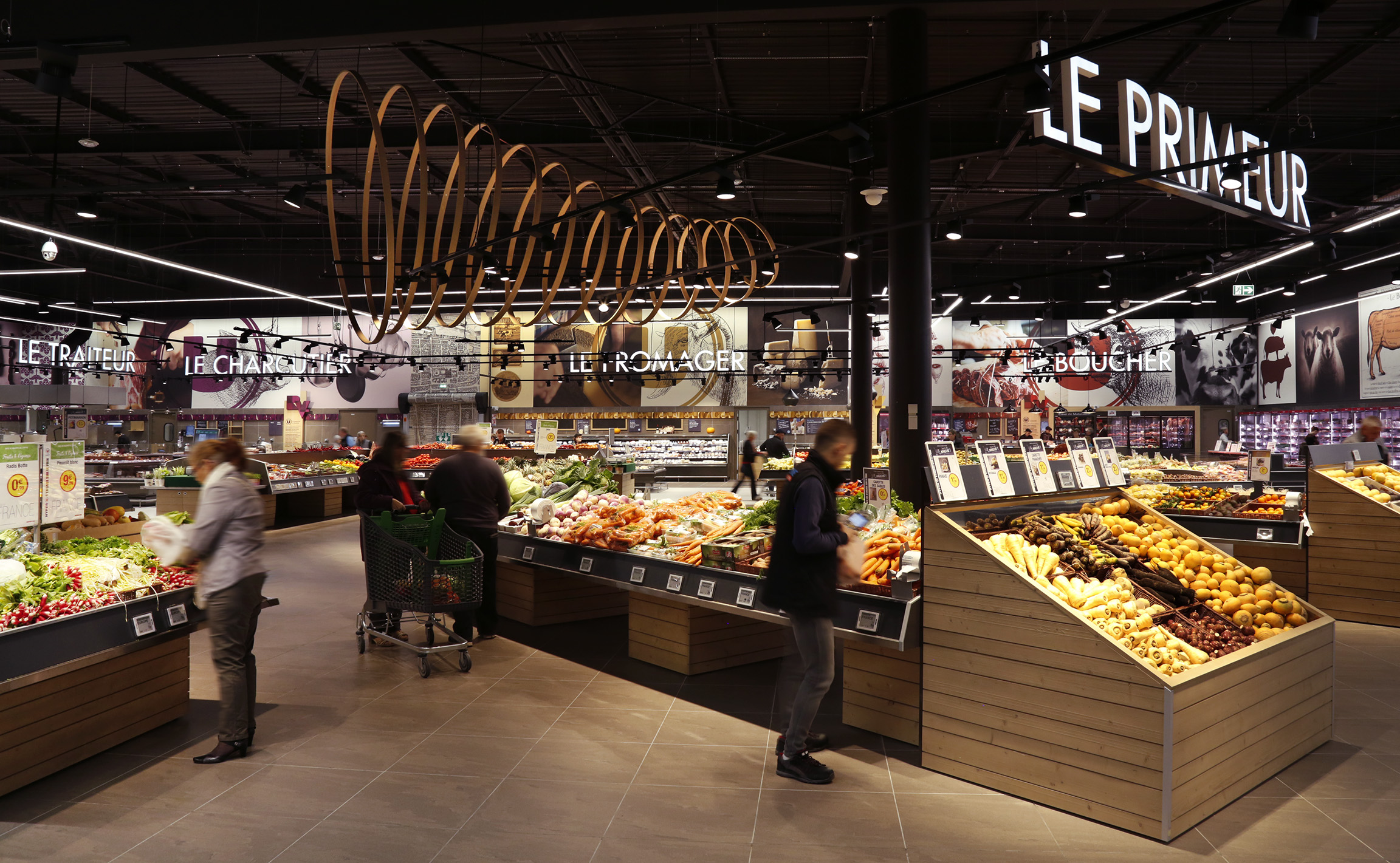
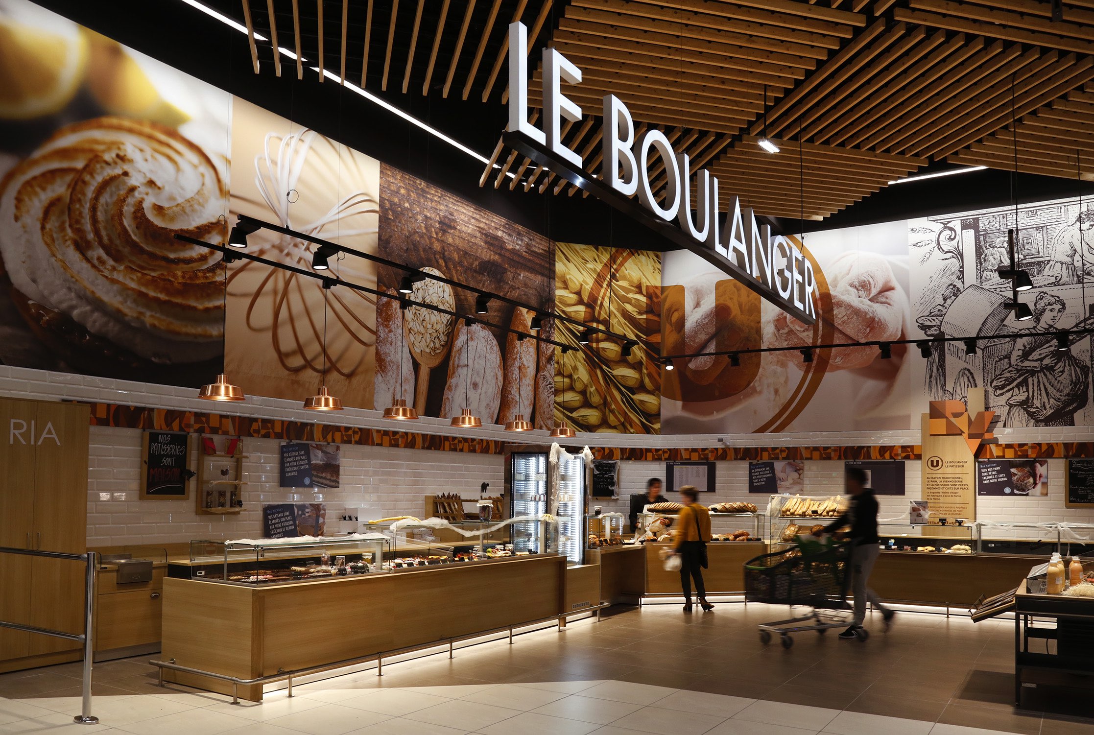
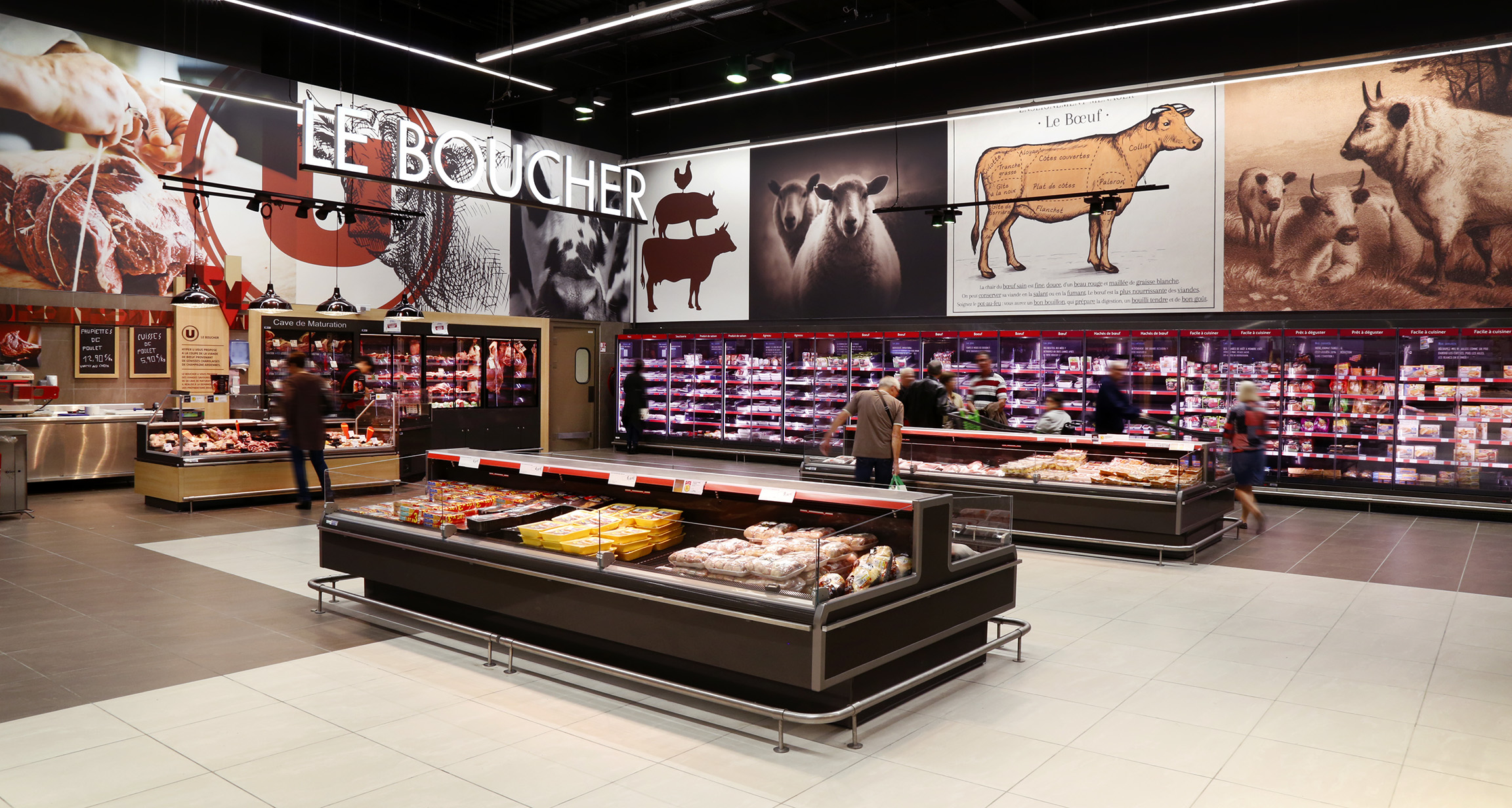
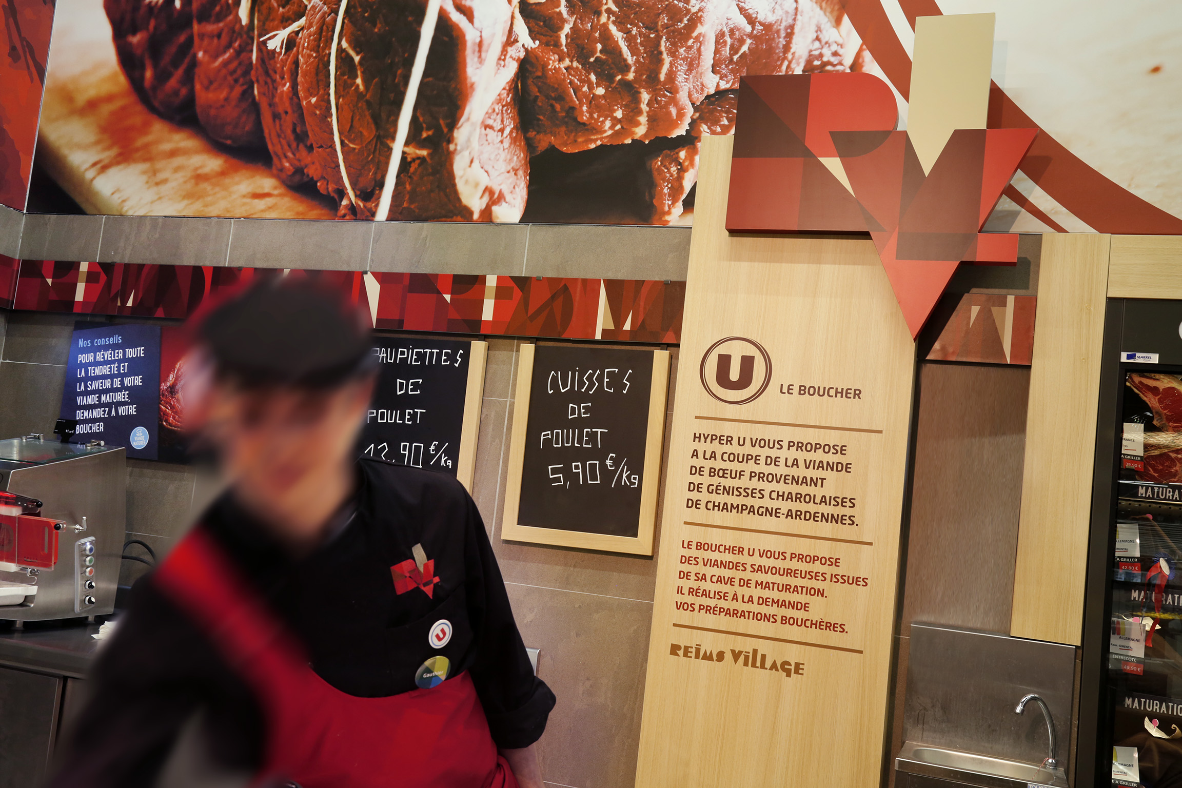
Immersive spaces—including a wine cellar, market-style produce section, and specialty counters—structure the in-store experience, supported by vertical signage and premium materials (wood, metal, signature lighting). The atmosphere is both gourmet and welcoming, blending warmth with a strong retail spirit.
The result: an average basket size 15% higher than forecast, and a customer experience that earned the 2018 Grand Prix Stratégies du Design (Gold). A new showcase for the U brand, where local and sustainable values become key drivers of appeal.
Selected work
-
Dove
View case studyBrand Management
Brand Strategy
Packaging Design
-
Renault
View case studyArchitectural Design
Brand Strategy
Customer Journey
-
PrestaShop
View case studyBrand Platform
Brand Territory
Digital
Tone of Voice
Visual Identity
-
Ricard
View case studyPackaging Design
-
Ferrero
View case studyArchitectural Design
Customer Journey
Tertiaire
Workspace Design
-
Sanofi
View case studyAnnual and Sustainability Reporting
Brand Platform
Corporate Communications
Social Media and Content
-
Clarins
View case studyCustomer Journey
Digital
Merchandising
Signage and Environment Design
-
Rexel
View case studyBrand Architecture & Portfolio Strategy
Brand Management
Brand Platform
Brand Positioning
Corporate Communications
Digital
Social Media and Content
Tone of Voice
Visual Identity
-
MAIF
View case studyArchitectural Design
Business Design
Customer Journey
Signage and Environment Design
-
Santé Verte
View case studyBrand Architecture & Portfolio Strategy
Brand Positioning
Brand Territory
Visual Identity
-
Maggi
View case studyBrand Strategy
Visual Identity
-
Tiger Beer (Heineken Group)
View case studyBrand Management
Merchandising
-
Dove
View case studyBrand Management
Brand Strategy
Packaging Design
-
Renault
View case studyArchitectural Design
Brand Strategy
Customer Journey
-
PrestaShop
View case studyBrand Platform
Brand Territory
Digital
Tone of Voice
Visual Identity
-
Ricard
View case studyPackaging Design
-
Ferrero
View case studyArchitectural Design
Customer Journey
Tertiaire
Workspace Design
-
Sanofi
View case studyAnnual and Sustainability Reporting
Brand Platform
Corporate Communications
Social Media and Content
-
Clarins
View case studyCustomer Journey
Digital
Merchandising
Signage and Environment Design
-
Rexel
View case studyBrand Architecture & Portfolio Strategy
Brand Management
Brand Platform
Brand Positioning
Corporate Communications
Digital
Social Media and Content
Tone of Voice
Visual Identity
-
MAIF
View case studyArchitectural Design
Business Design
Customer Journey
Signage and Environment Design
-
Santé Verte
View case studyBrand Architecture & Portfolio Strategy
Brand Positioning
Brand Territory
Visual Identity
-
Maggi
View case studyBrand Strategy
Visual Identity
-
Tiger Beer (Heineken Group)
View case studyBrand Management
Merchandising
