Cultiver la créativité pour faire grandir un groupe international
Entreprise familiale et indépendante depuis 1952, Gautier Semences conçoit et produit des semences potagères pour les professionnels, en cultivant un ancrage fort en Provence. À l’occasion de ses 70 ans, l’entreprise amorce un nouveau chapitre : comment s’affirmer face aux géants du secteur et porter sa croissance à l’international ?
Après un travail d’enquête interne et externe, la créativité s’est imposée comme valeur différenciante. C’est cette idée de “Creative Breeding” qui a guidé notre repositionnement stratégique et créatif.
Une créativité présente dans la recherche variétale, dans les équipes pluridisciplinaires, et dans la relation clients fondée sur la co-construction.
Lonsdale a conçu une identité visuelle organique et structurée, à l’image de la nature. Le nouveau logotype intègre 4 graines : symboles du métier et des 4 générations de la famille Gautier.
Un univers graphique vivant, inspiré des textures, couleurs et formes des semences et légumes, ancré en Provence. Les illustrations en encre et aquarelle traduisent avec sensibilité les valeurs humaines et le souffle pionnier de la marque.
Une nouvelle identité forte pour faire rayonner Gautier Semences dans 53 pays.


Selected work


Renault
View case studyDove
View case study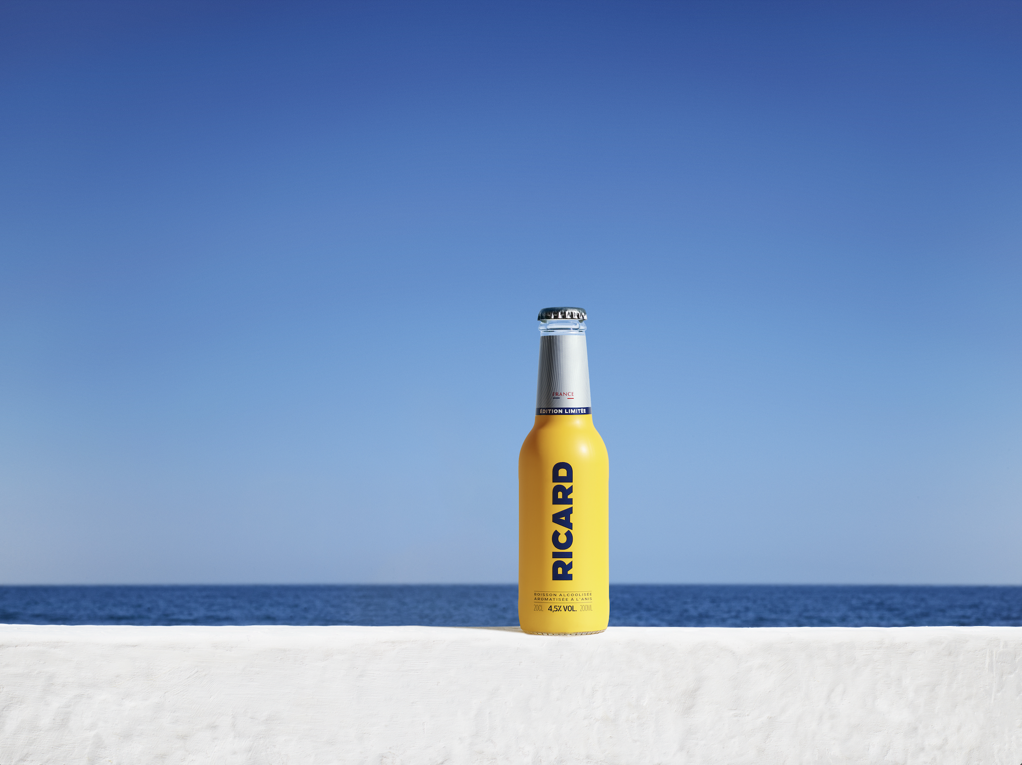

Ricard
View case study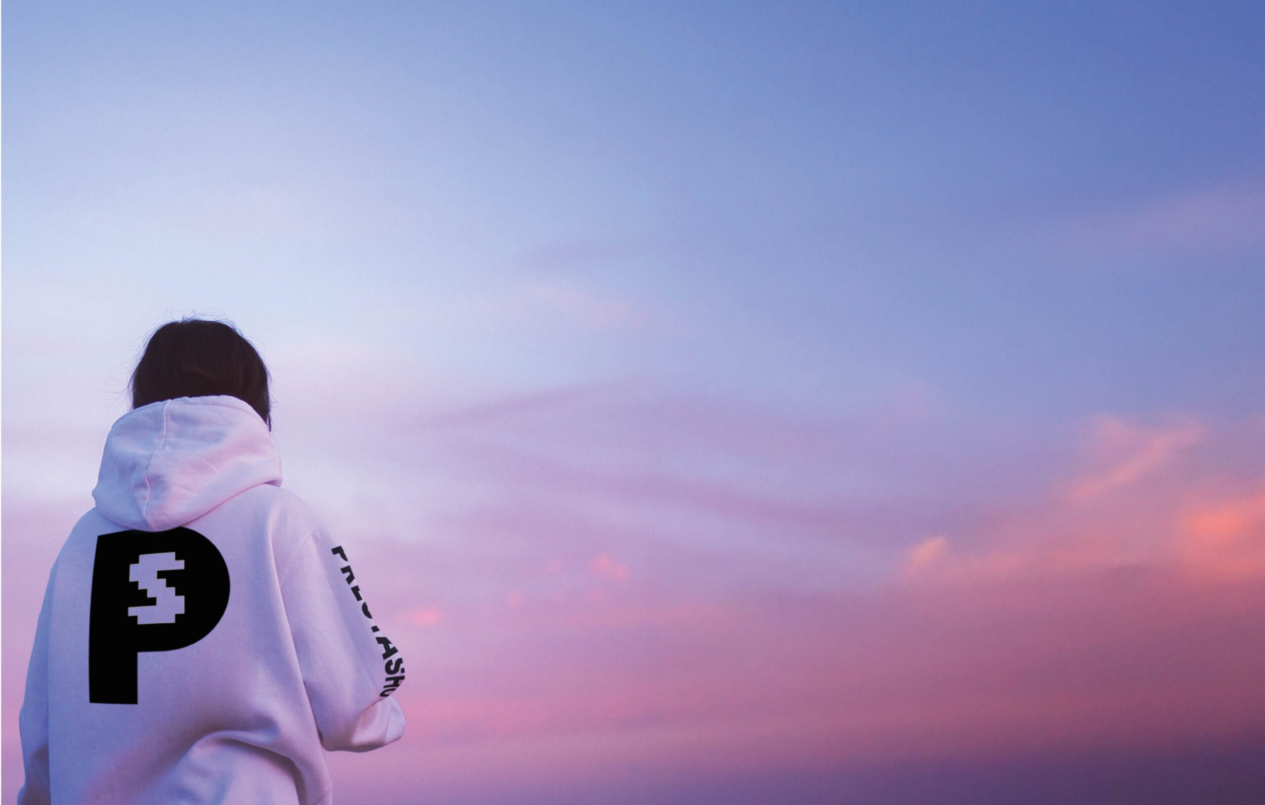

PrestaShop
View case study

Ferrero
View case study

Sanofi
View case study

Clarins
View case study

Rexel
View case study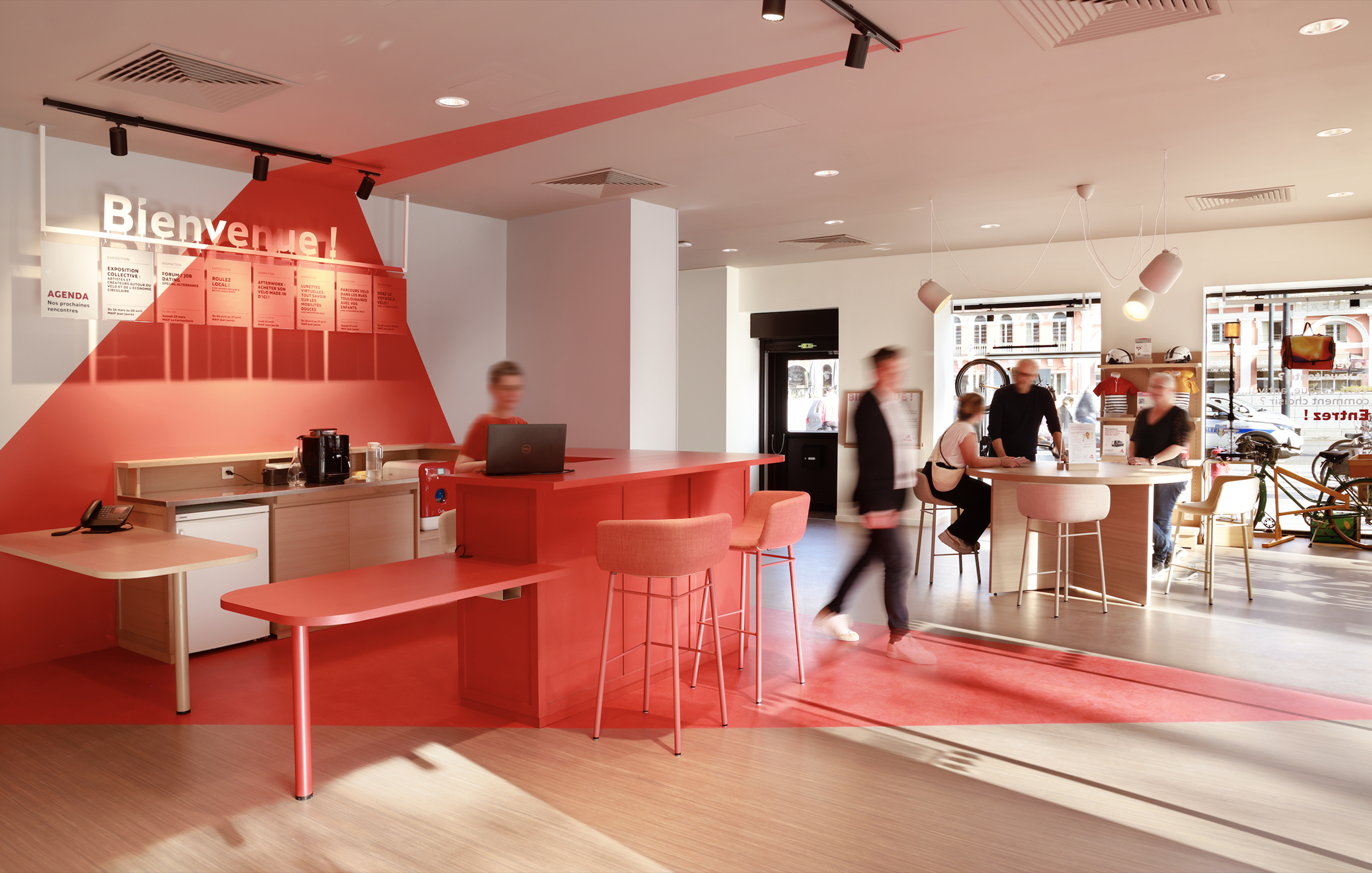

MAIF
View case study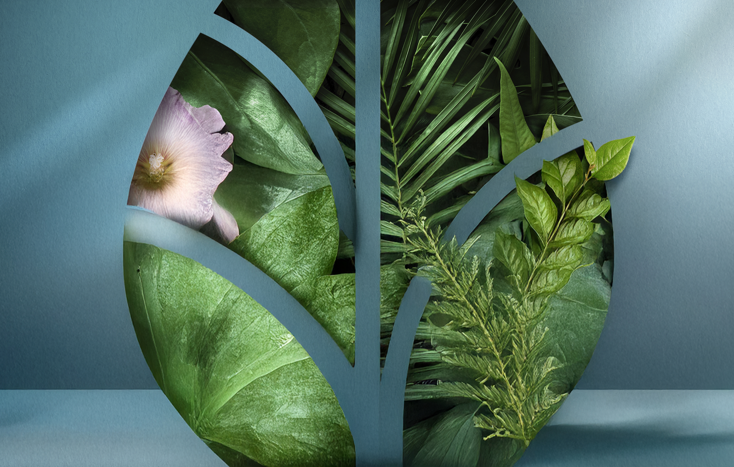

Santé Verte
View case study

Maggi
View case study
Tiger Beer (Heineken Group)
View case study
Renault
View case studyDove
View case study
Ricard
View case study
PrestaShop
View case study
Ferrero
View case study
Sanofi
View case study
Clarins
View case study
Rexel
View case study
MAIF
View case study
Santé Verte
View case study
Maggi
View case study
Tiger Beer (Heineken Group)
View case studyDove
View case study
Ricard
View case study
PrestaShop
View case study
Ferrero
View case study
Sanofi
View case study
Clarins
View case study
Rexel
View case study
MAIF
View case study
Santé Verte
View case study
Maggi
View case study
Tiger Beer (Heineken Group)
View case study
Renault
View case studyDove
View case study
Ricard
View case study
PrestaShop
View case study
Ferrero
View case study
Sanofi
View case study
Clarins
View case study
Rexel
View case study
MAIF
View case study
Santé Verte
View case study
Maggi
View case study
Tiger Beer (Heineken Group)
View case study
Renault
View case study-
Renault
View case study -
Dove
View case study -
Ricard
View case study -
PrestaShop
View case study -
Ferrero
View case study -
Sanofi
View case study -
Clarins
View case study -
Rexel
View case study -
MAIF
View case study -
Santé Verte
View case study -
Maggi
View case study -
Tiger Beer (Heineken Group)
View case study -
Renault
View case study -
Dove
View case study -
Ricard
View case study -
PrestaShop
View case study -
Ferrero
View case study -
Sanofi
View case study -
Clarins
View case study -
Rexel
View case study -
MAIF
View case study -
Santé Verte
View case study -
Maggi
View case study -
Tiger Beer (Heineken Group)
View case study