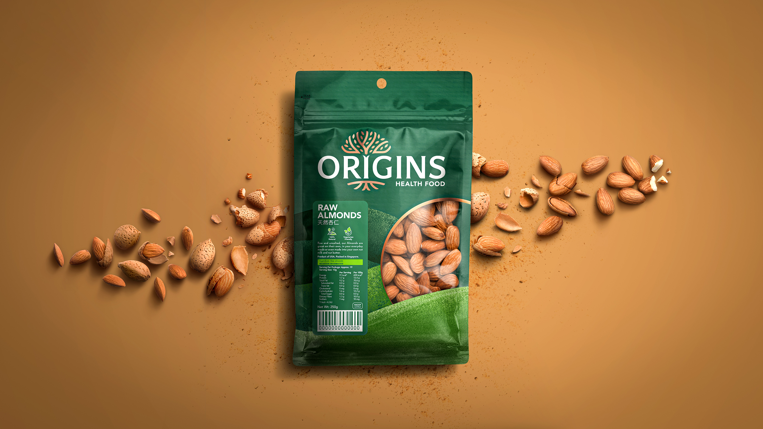
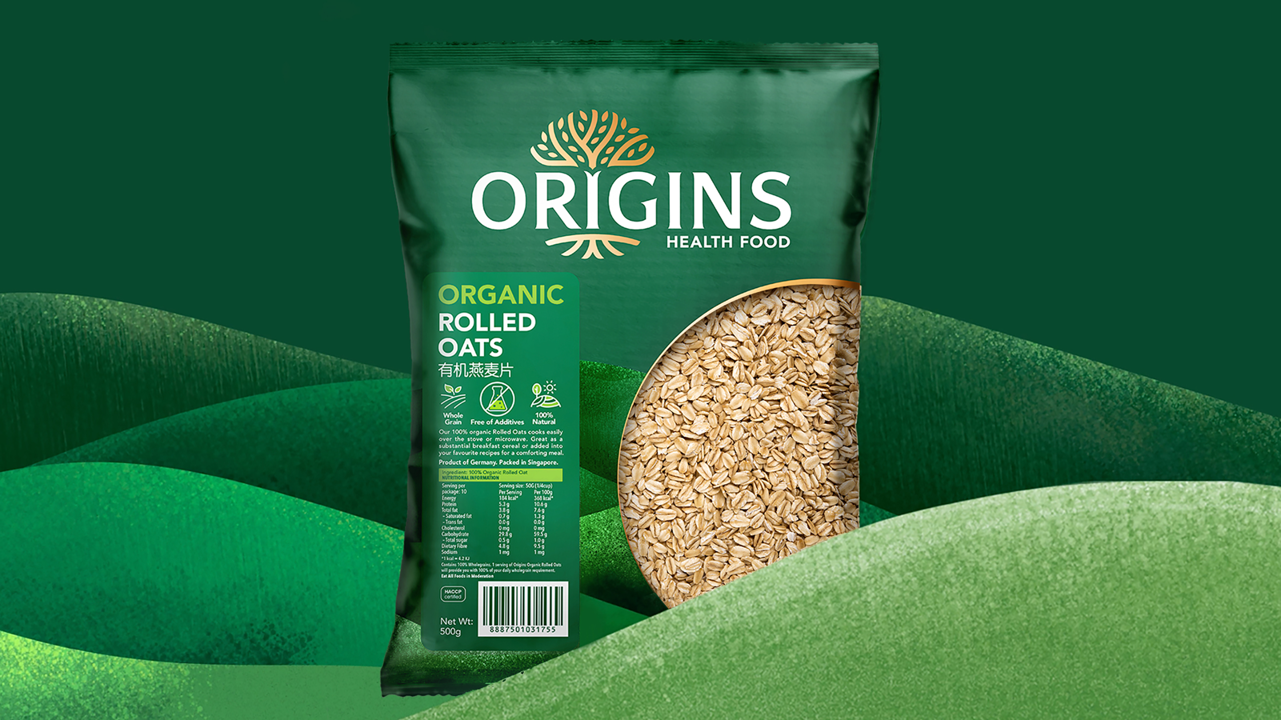
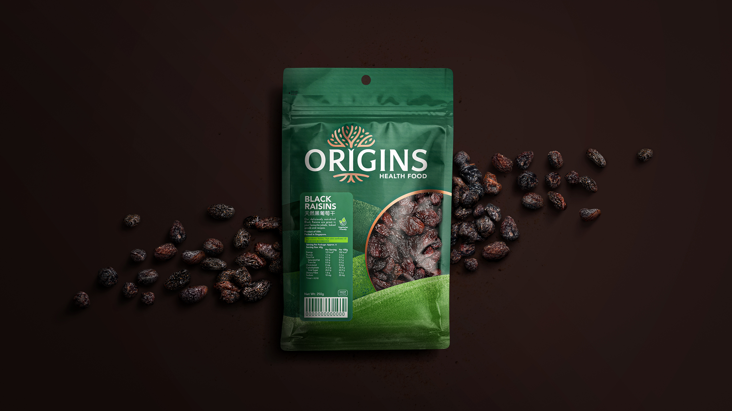
Origins

(NTUC FairPrice)
The tree of life

THE BRIEF

NTUC FairPrice is Singapore’s largest and leading supermarket chain with 100 stores across the island. In 2017 FairPrice acquired Origins, a pioneer brand that specializes in all-natural, organic, and better-for-you ingredient-led products. Our teams at Why by Lonsdale were approached by NTUC FairPrice to do a complete brand visual identity and packaging design refresh for Origins, that brings relevance and credibility in a world that’s increasingly health conscious and on the lookout for more natural and accessible solutions.

OUR RECOMMENDATION

Leveraging on health trends, a strong brand heritage and good presence, we redeveloped Origins brand positioning and story establishing relevance in a highly competitive and fragmented market.

A deep dive into the brand proved that there was inconsistency in the identity and logo both on and off pack, so we took the opportunity to build a stronger more meaningful brand asset. The evolved logo was crafted to anchor around the ‘Tree of Life’, reflecting the brand’s dedication to the entire sourcing process, from ‘root to fruit’.

We introduced a secondary brand asset, the ‘rolling hills’, featured across on and off pack touchpoints, serves as a meaningful brand asset and creates a centrepiece of the new brand world; approachable, healthy and naturally empowering it is at the core of what makes Origins recognizable and is integral to the visual brand language.

Addressing printing budget constraints we created one packaging design for the dry food goods and showcased varianting through the stickered label. A window was created on pack to showcase the product and the shape mimics the ‘O’ of ‘Origins’. The design system was then extended across the existing range and into new products and categories.

The result is a recognizable, consistent brand identity with a targeted communication message that strengthens brand equity, drives the naturality of the brand, while keeping the premiumness at the forefront.