The BRIEF
In a growing and increasingly competitive supplement market, Santé Verte, a specialist in naturopathic-inspired supplements, called on Lonsdale to review its strategy and reposition the brand, in order to restore its meaning and coherence, and to make the brand stand out in pharmacies.
Notre recommandation
Using a Design Thinking approach, our teams analyzed new consumer drivers, pharmacists’ and consumers’ expectations, and the market, and conducted a study on the “health and well-being” trends of tomorrow. This in-depth work allowed us to write a new expert positioning, perpetuating the heritage of the brand’s naturopathic founders. With the mission of making natural health solutions accessible to as many people as possible, the brand has taken on a brand new personality, one that is rooted in its roots, positive and conversational.
To support this repositioning, the agency’s Consumer Branding division developed the brand’s identity and territory using its proprietary CréaLab methodology – a creative workshop that helps to feed the marketing brief with creative content – in a true co-construction approach with Santé Verte teams.
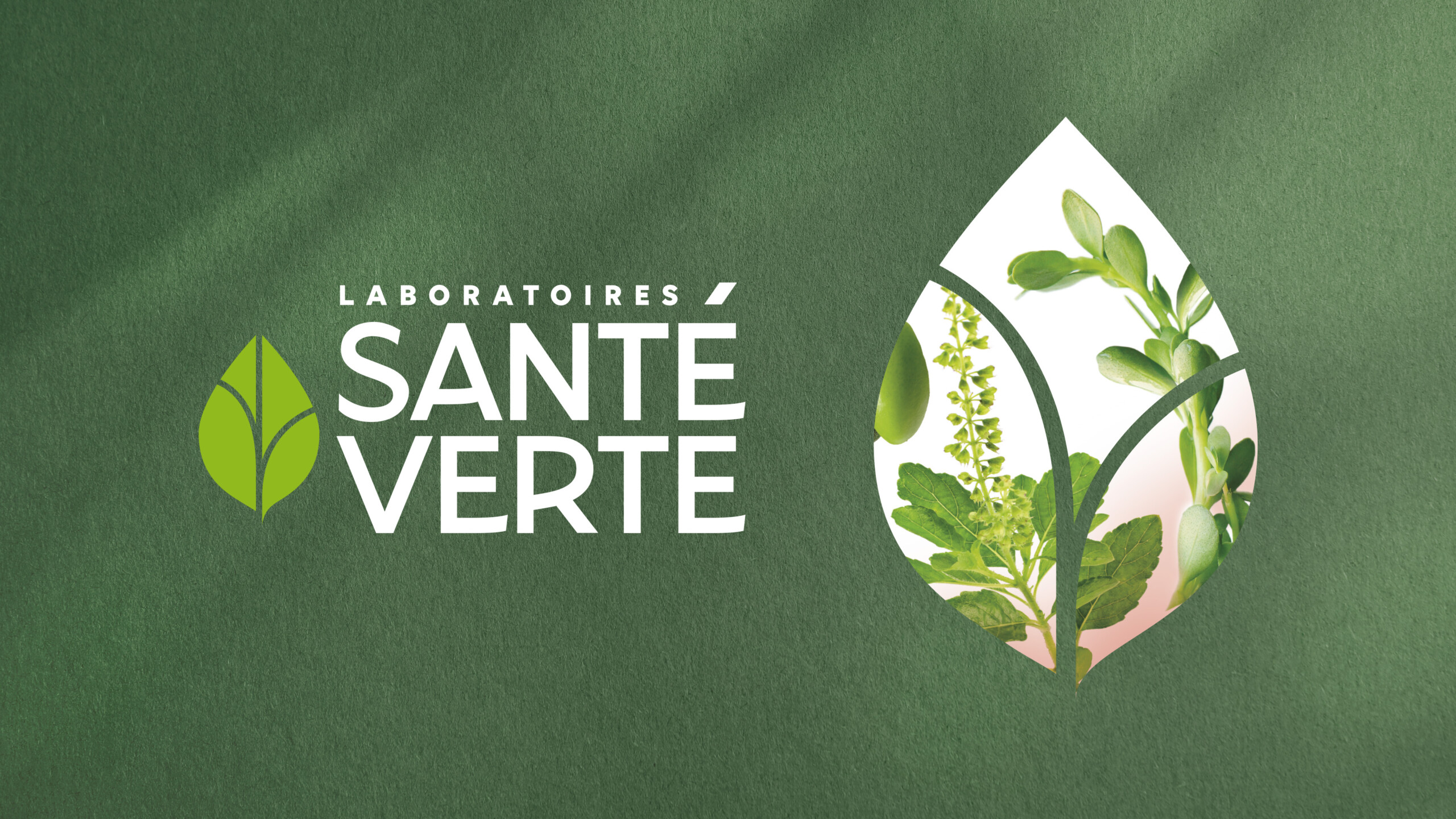
The result is a new identity that emphasizes and reinforces the brand’s DNA: naturalness, effectively and simply. The new logo asserts the status of an established and expert laboratory, and highlights the perfect balance between health and nature promised by the brand, through the drawing of a new leaf, as an inclusive and iconic symbol at the same time. This logo is accompanied by the creation of a key visual identity: the Green Health leaf that opens on the key natural ingredients of the formulation, and is gently activated.
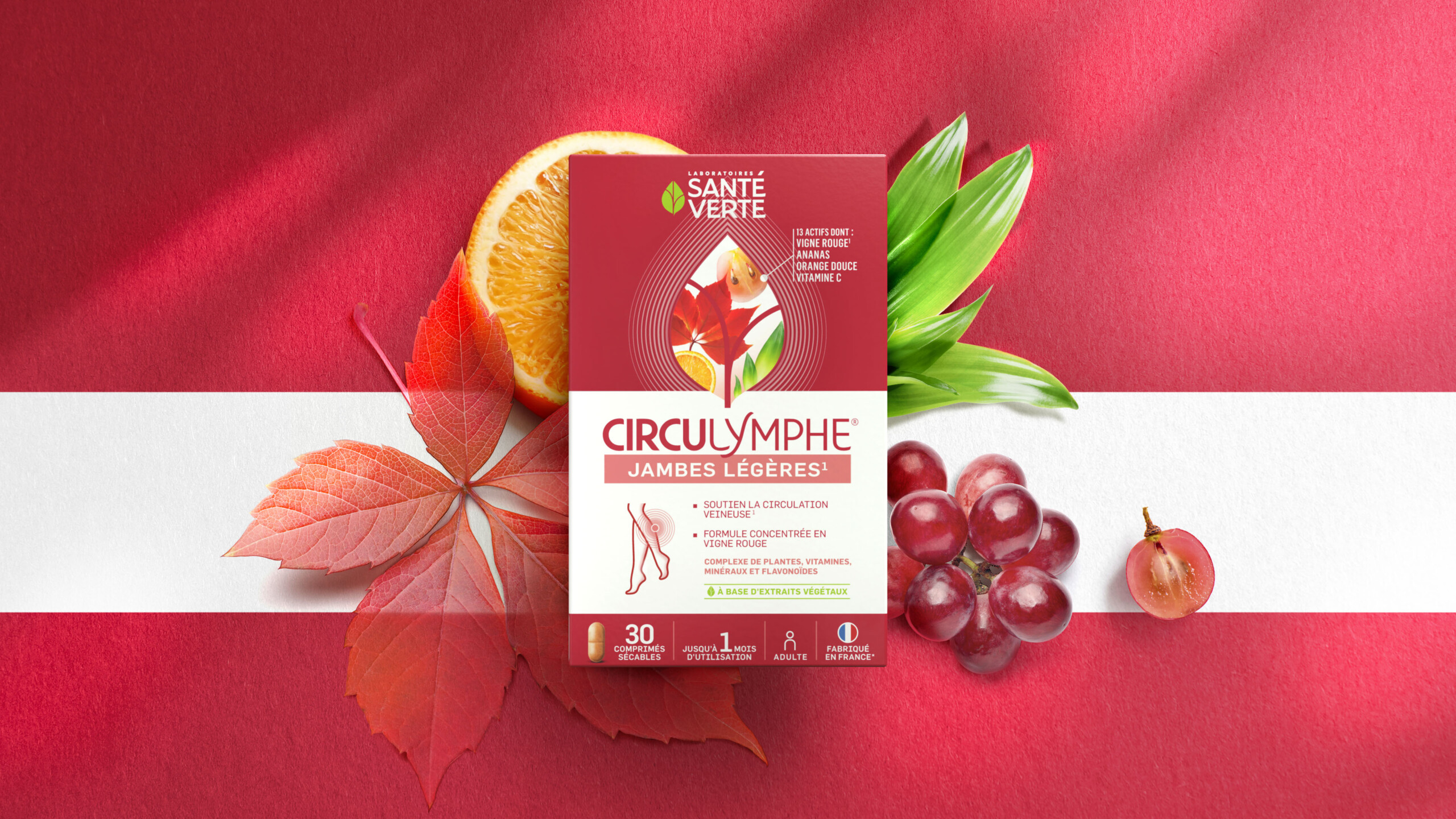
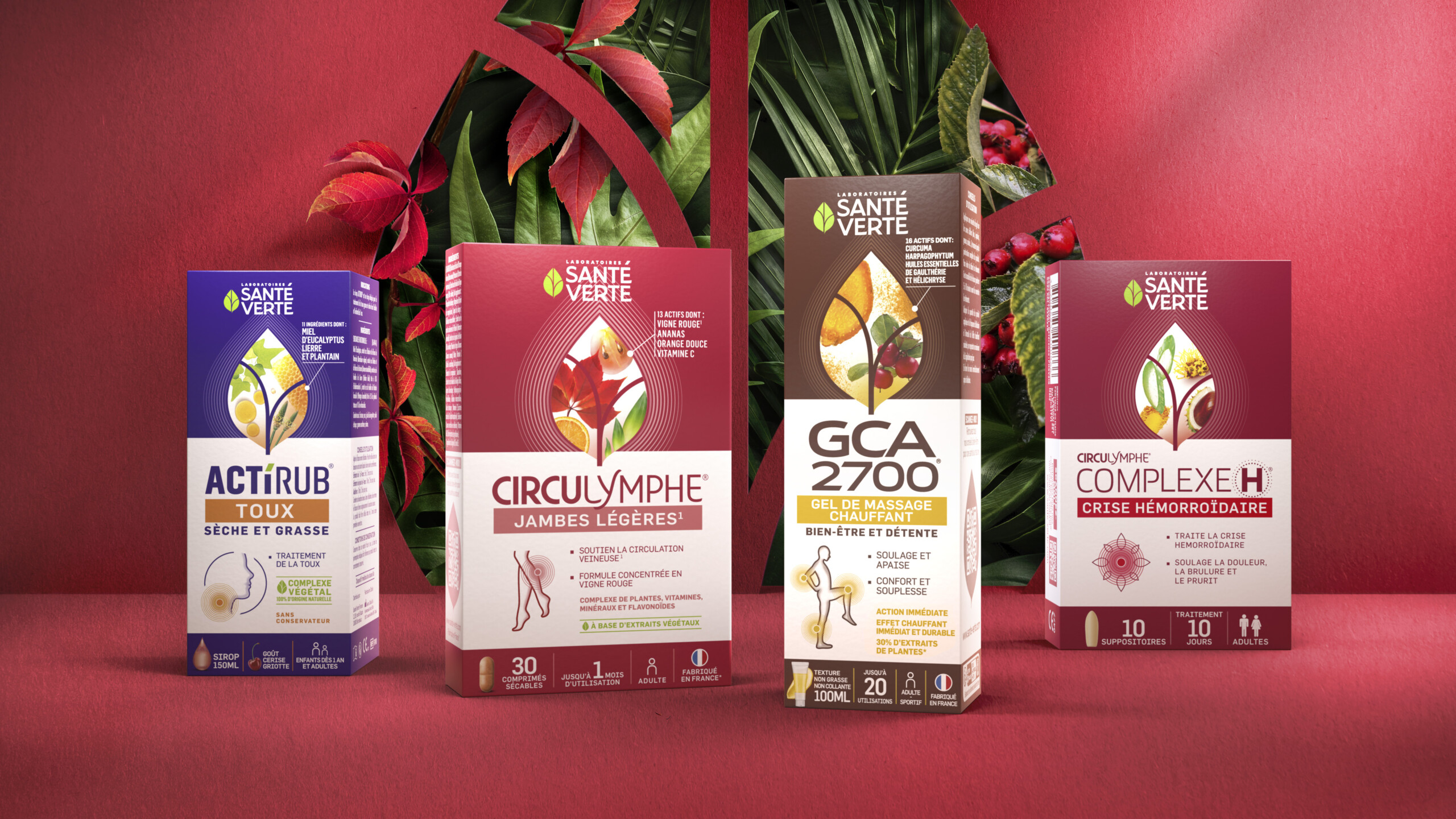
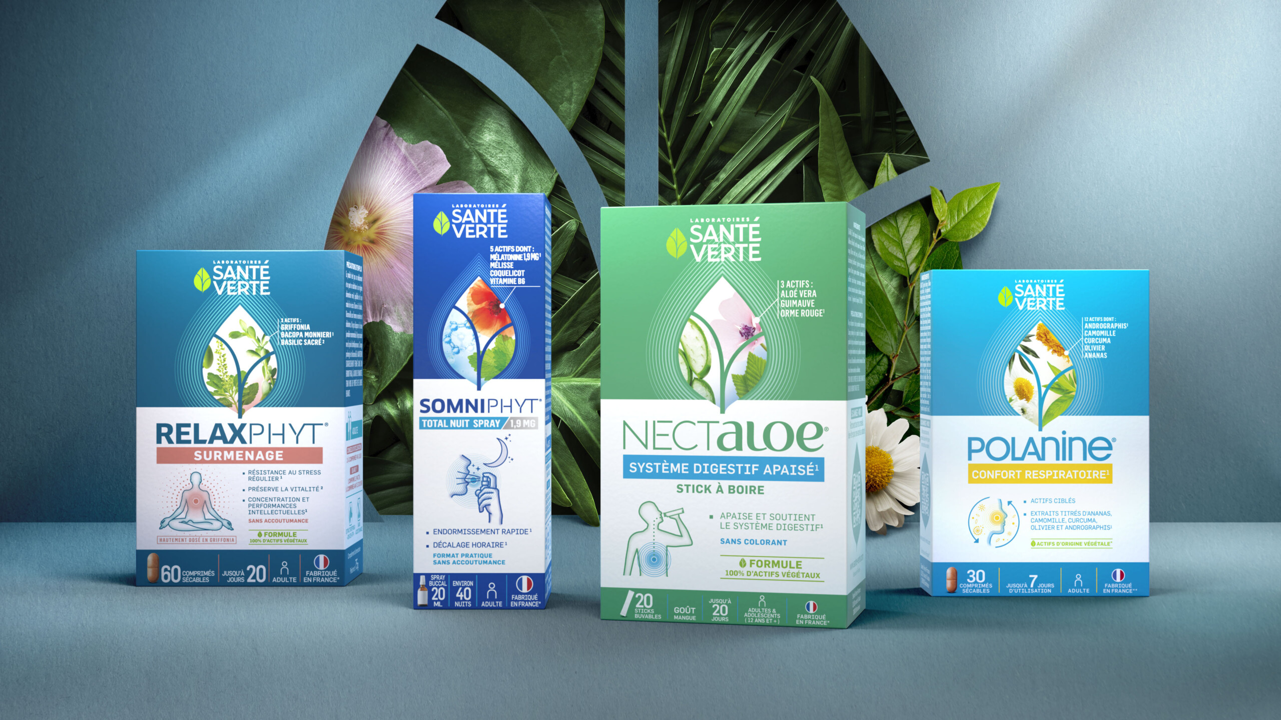
The work on the packaging is based on a constant branding system that establishes the parent brand as the laboratory expert in natural formulas, presents the daughter brands in a white structure, directly associated with the destination, benefits and specific RTB, and simplifies the understanding of use with the creation of an area of educational discourse at the bottom of the pack in the form of program.
The result of 18 months of work, the new packaging identity is available for all 9 daughter brands with more than 80 references, including 26 products already visible in pharmacies.