A Renewed Identity Anchored in Natural Health
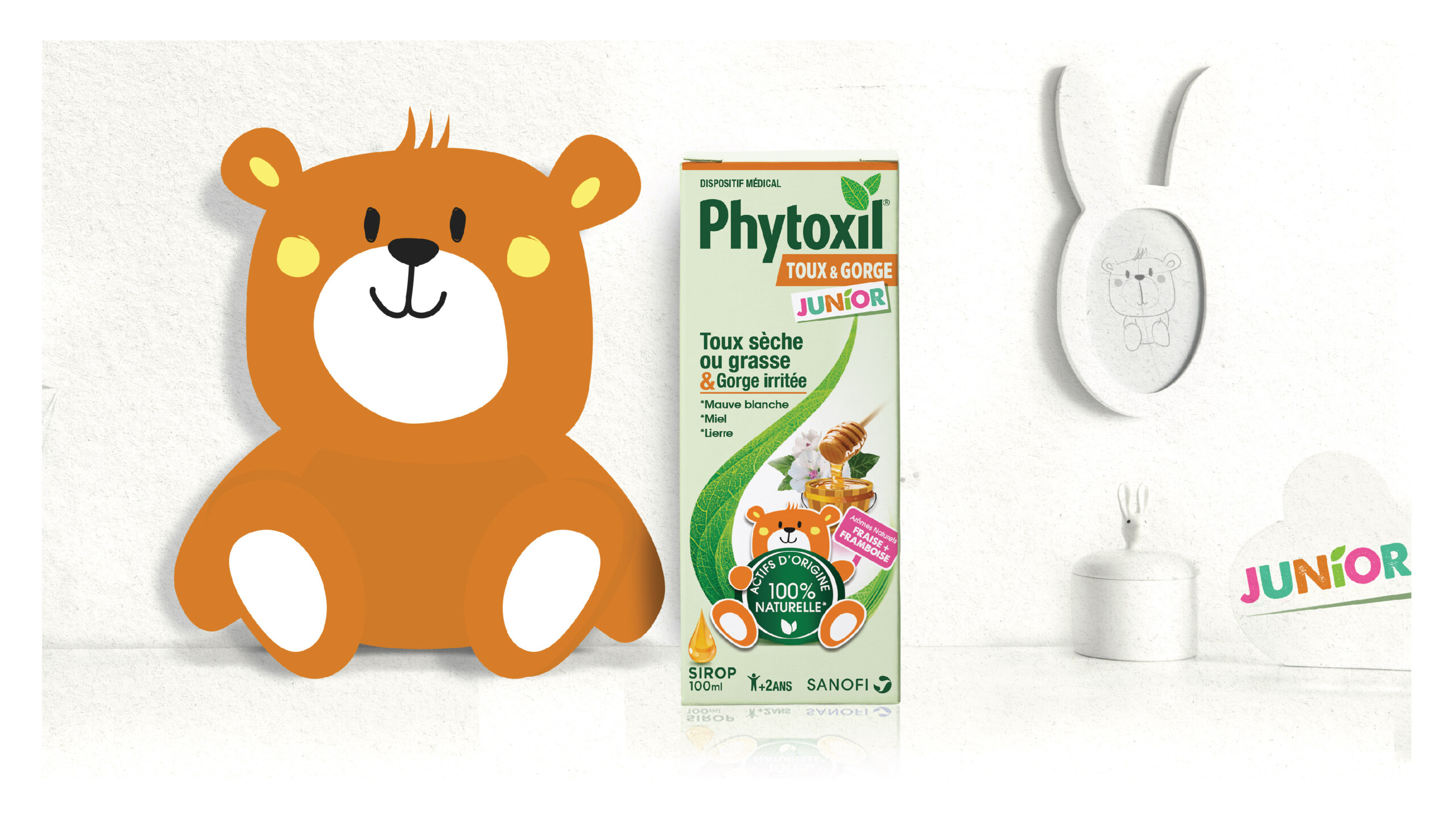
Sanofi set out to establish Phytoxil as a standalone brand in the natural healthcare space, aiming to boost growth, build brand recognition, and expand beyond its origins in cough relief into new therapeutic areas.
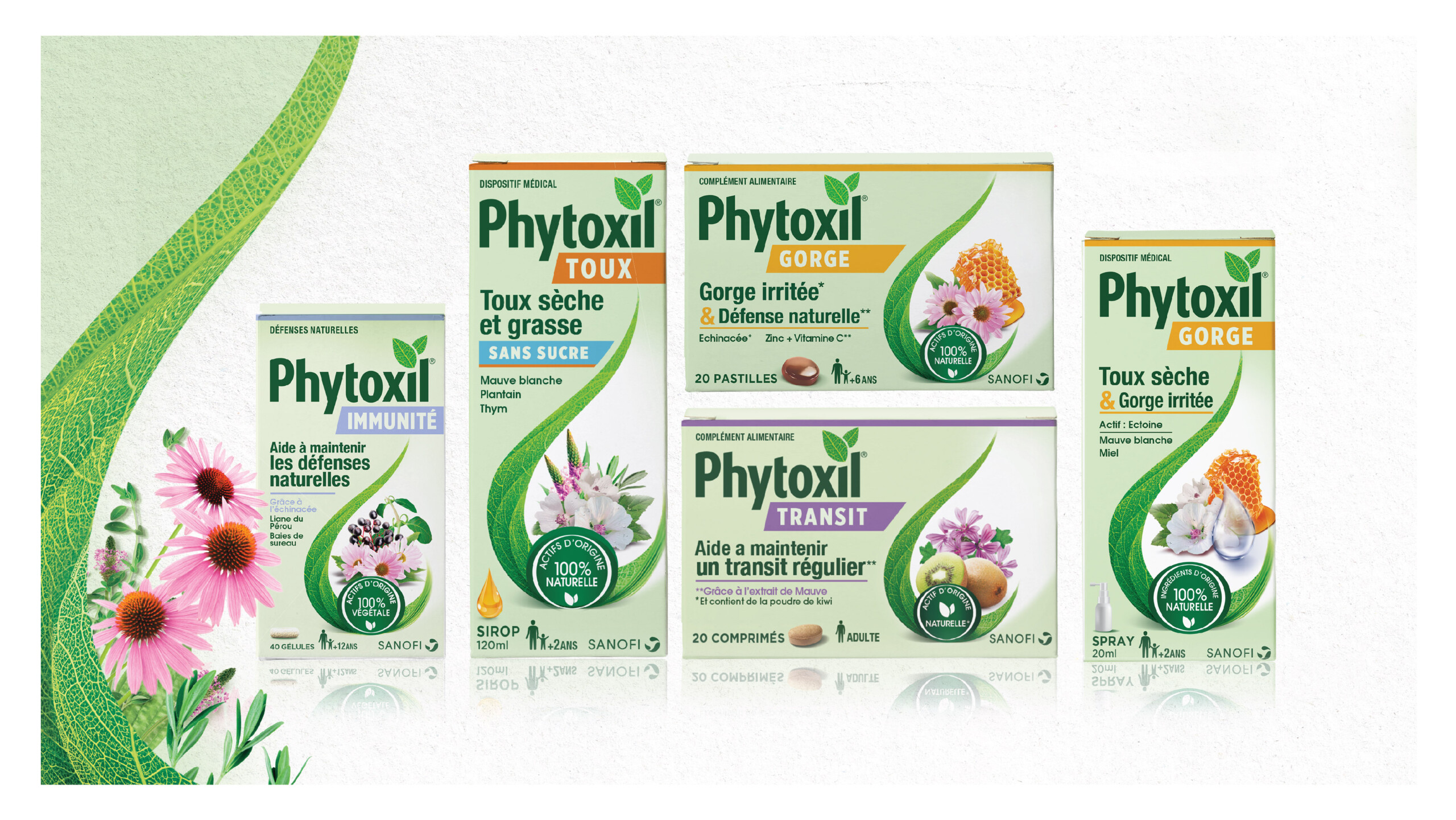
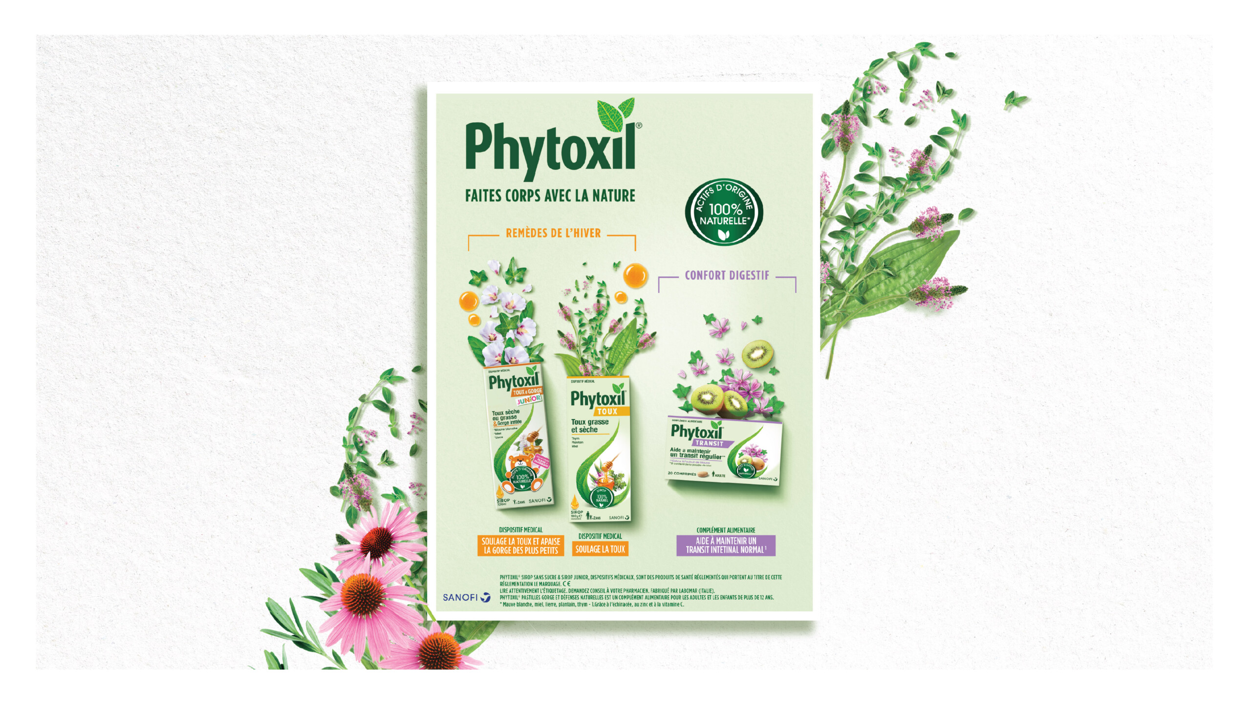
Lonsdale supported this transformation by creating a flexible, distinctive brand identity that could accommodate future innovations while ensuring strong visibility for both pharmacists and consumers.
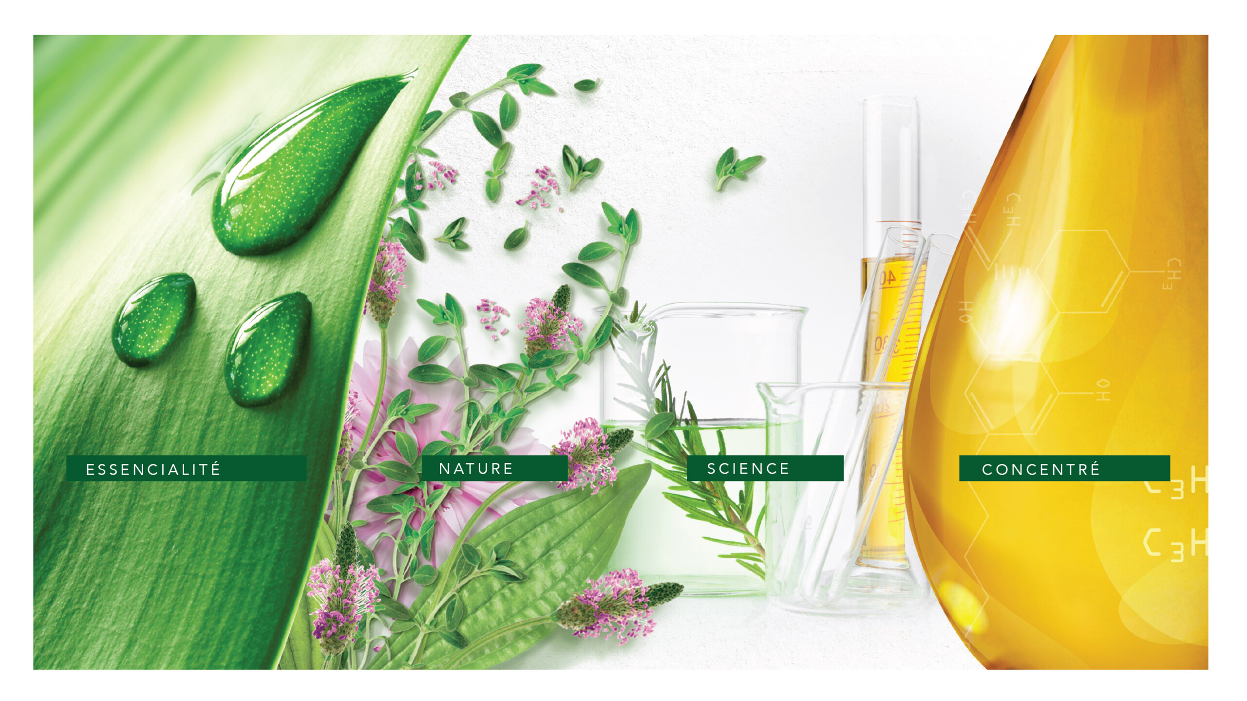
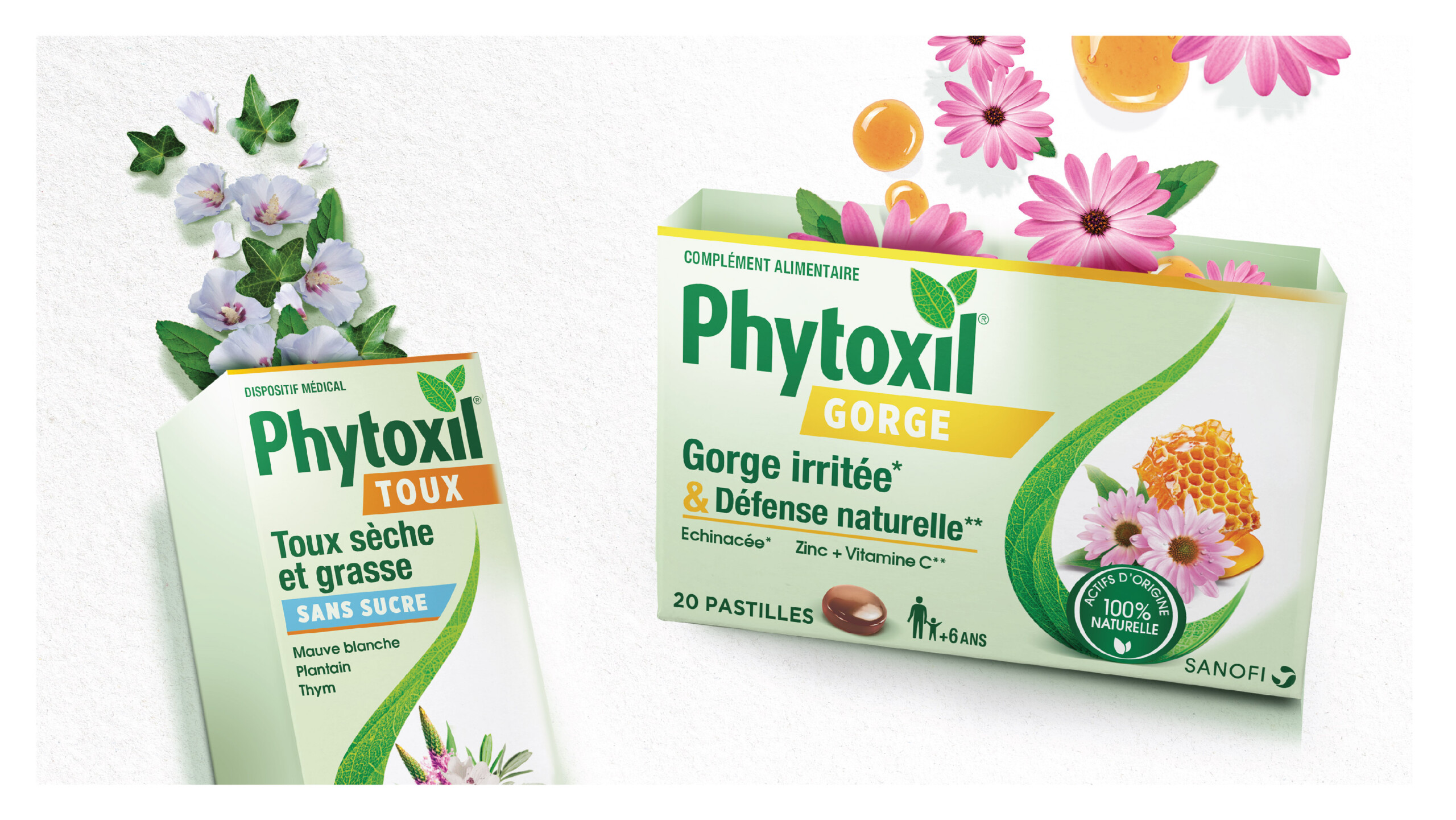
We began by analyzing the codes of the “active nature” category and mapping competitor strategies to identify the most relevant graphic territory. The result: a visual language that strikes a balance between science and nature, with a clear, structured segmentation system.
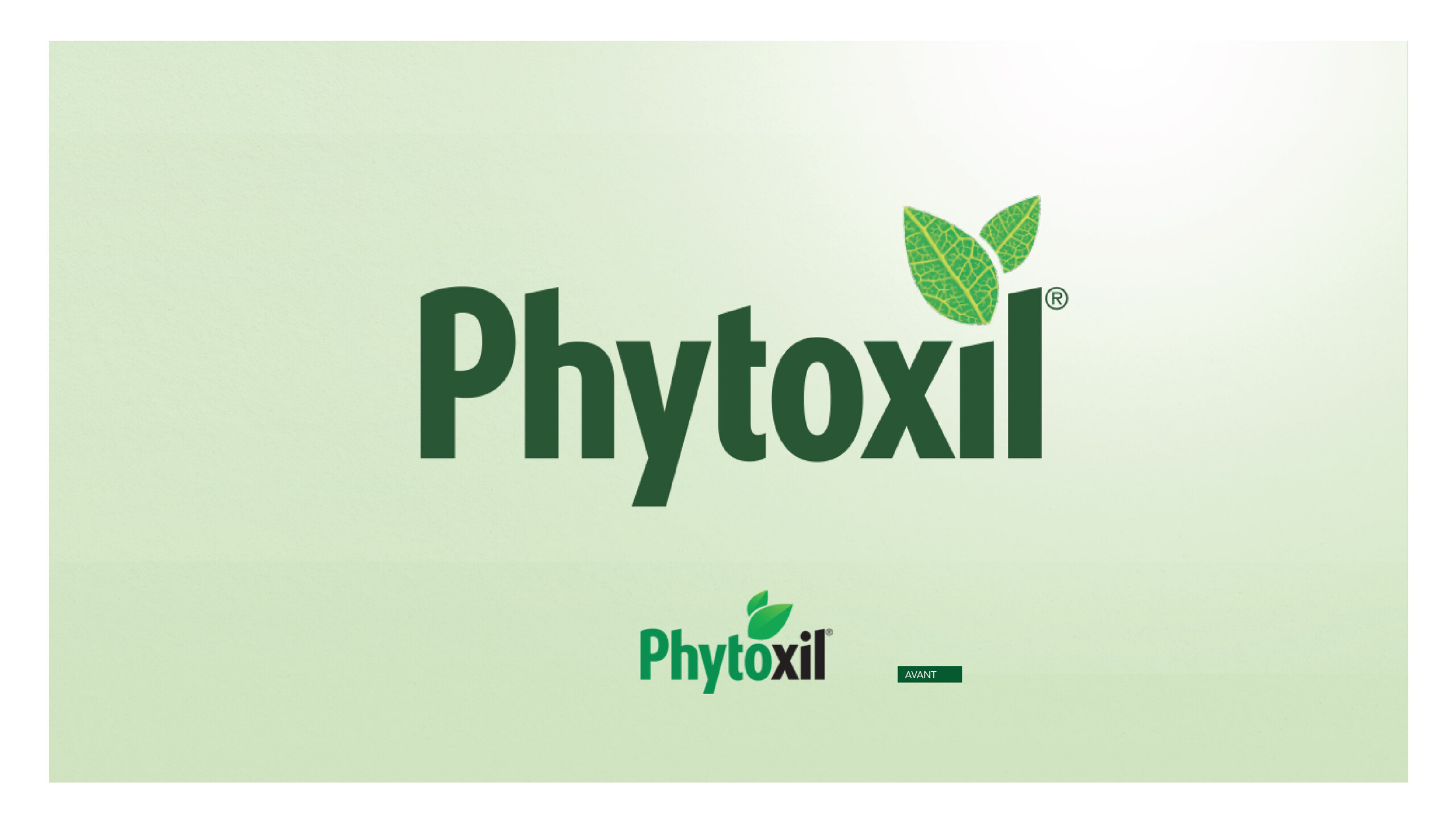
The brand’s iconic leaf was redesigned to be more organic and symbolic. A soft, desaturated green, inspired by cosmetics and wellness, was adopted as the signature brand color, setting Phytoxil apart from traditional “clinical” health cues.
Typography and iconography were selected to express transparency, purity, and sincerity—values at the heart of the brand.
This new identity equips Phytoxil to become a trusted, natural daily health companion, with a strong and cohesive presence across categories.
Selected work
Dove
View case study

Renault
View case study

PrestaShop
View case study

Ricard
View case study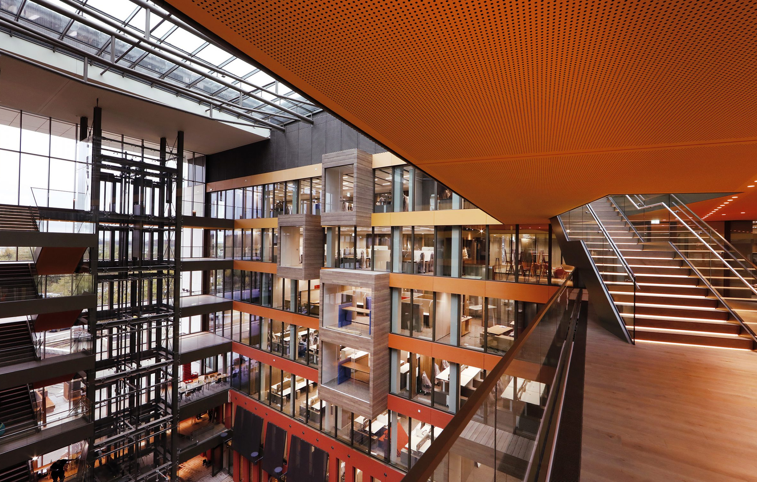

Ferrero
View case study

Sanofi
View case study

Clarins
View case study

Rexel
View case study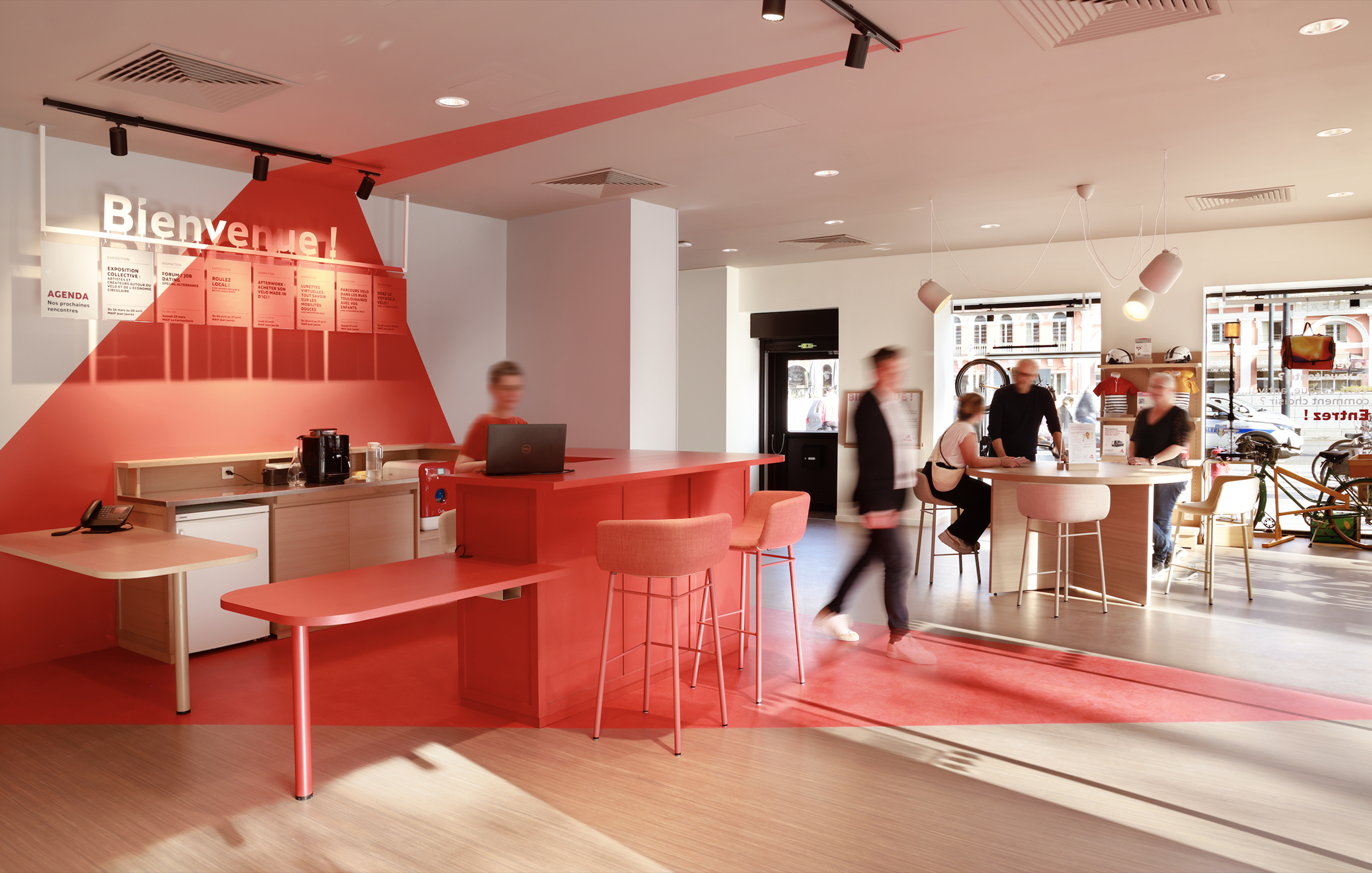

MAIF
View case study

Santé Verte
View case study

Maggi
View case study
Tiger Beer (Heineken Group)
View case studyDove
View case study
Renault
View case study
PrestaShop
View case study
Ricard
View case study
Ferrero
View case study
Sanofi
View case study
Clarins
View case study
Rexel
View case study
MAIF
View case study
Santé Verte
View case study
Maggi
View case study
Tiger Beer (Heineken Group)
View case study
Renault
View case study
PrestaShop
View case study
Ricard
View case study
Ferrero
View case study
Sanofi
View case study
Clarins
View case study
Rexel
View case study
MAIF
View case study
Santé Verte
View case study
Maggi
View case study
Tiger Beer (Heineken Group)
View case studyDove
View case study
Renault
View case study
PrestaShop
View case study
Ricard
View case study
Ferrero
View case study
Sanofi
View case study
Clarins
View case study
Rexel
View case study
MAIF
View case study
Santé Verte
View case study
Maggi
View case study
Tiger Beer (Heineken Group)
View case studyDove
View case study-
Dove
View case study -
Renault
View case study -
PrestaShop
View case study -
Ricard
View case study -
Ferrero
View case study -
Sanofi
View case study -
Clarins
View case study -
Rexel
View case study -
MAIF
View case study -
Santé Verte
View case study -
Maggi
View case study -
Tiger Beer (Heineken Group)
View case study -
Dove
View case study -
Renault
View case study -
PrestaShop
View case study -
Ricard
View case study -
Ferrero
View case study -
Sanofi
View case study -
Clarins
View case study -
Rexel
View case study -
MAIF
View case study -
Santé Verte
View case study -
Maggi
View case study -
Tiger Beer (Heineken Group)
View case study