Reinventing Packaging Identity for a Regional FMCG Leader
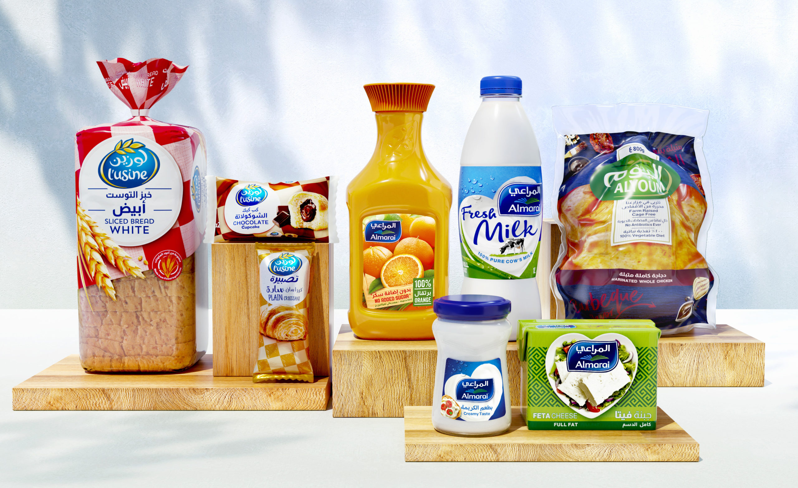
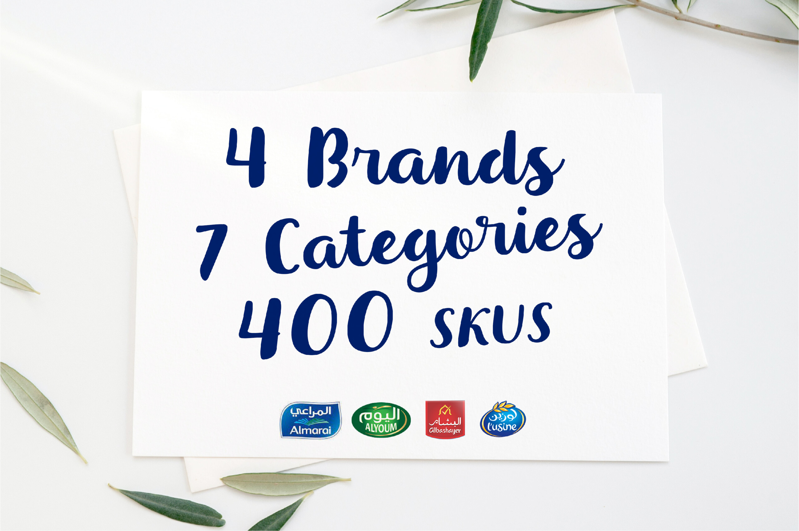
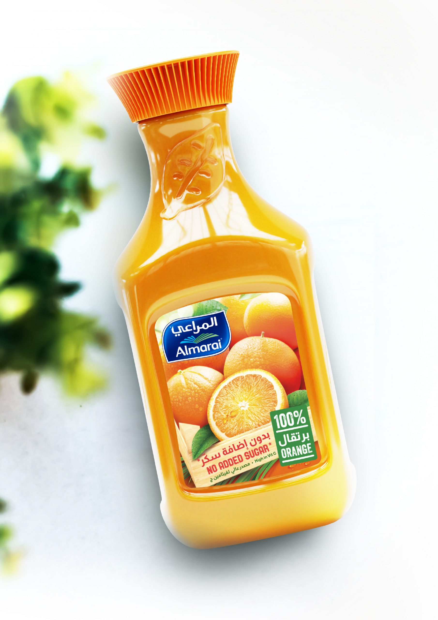
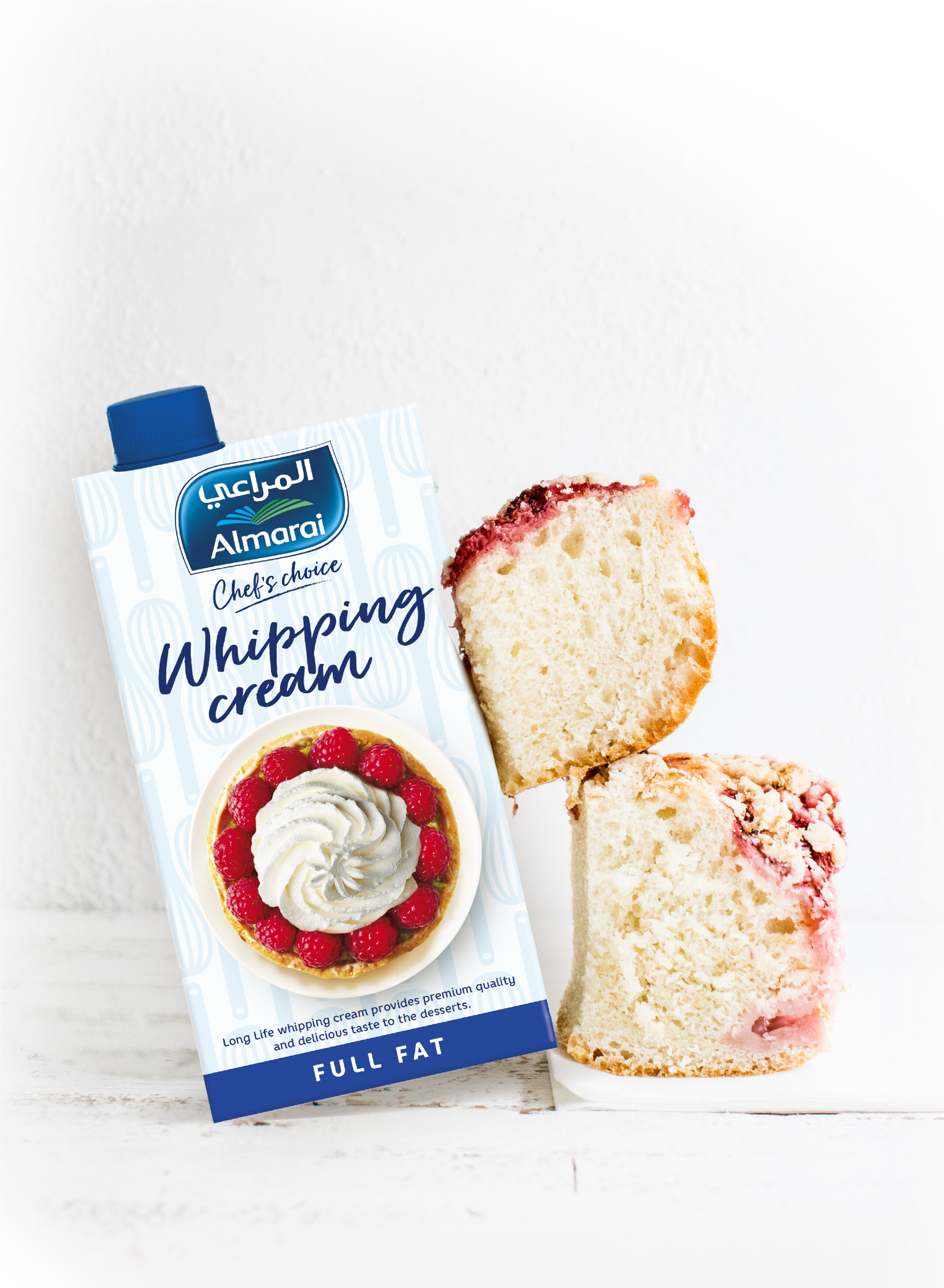
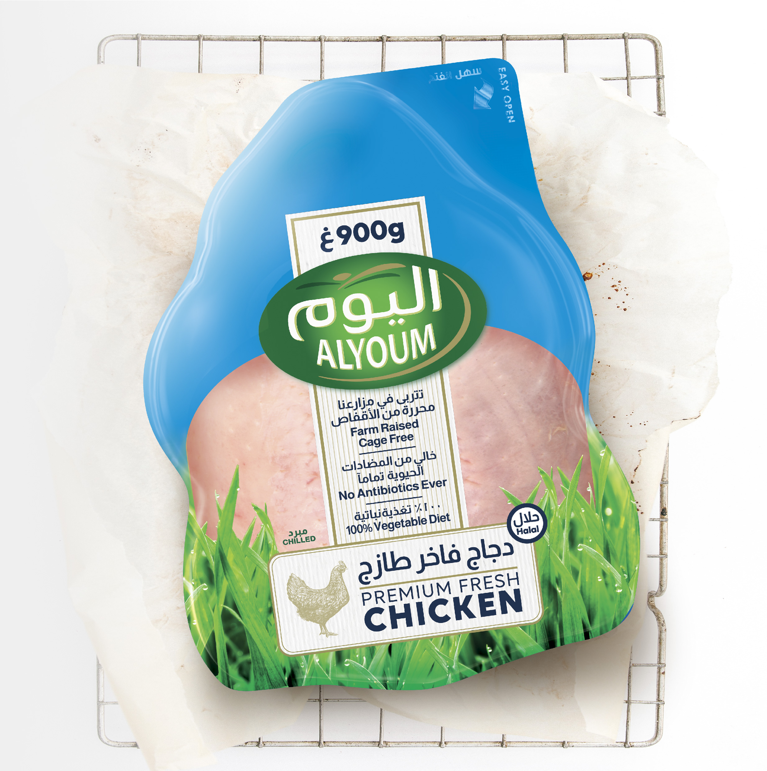
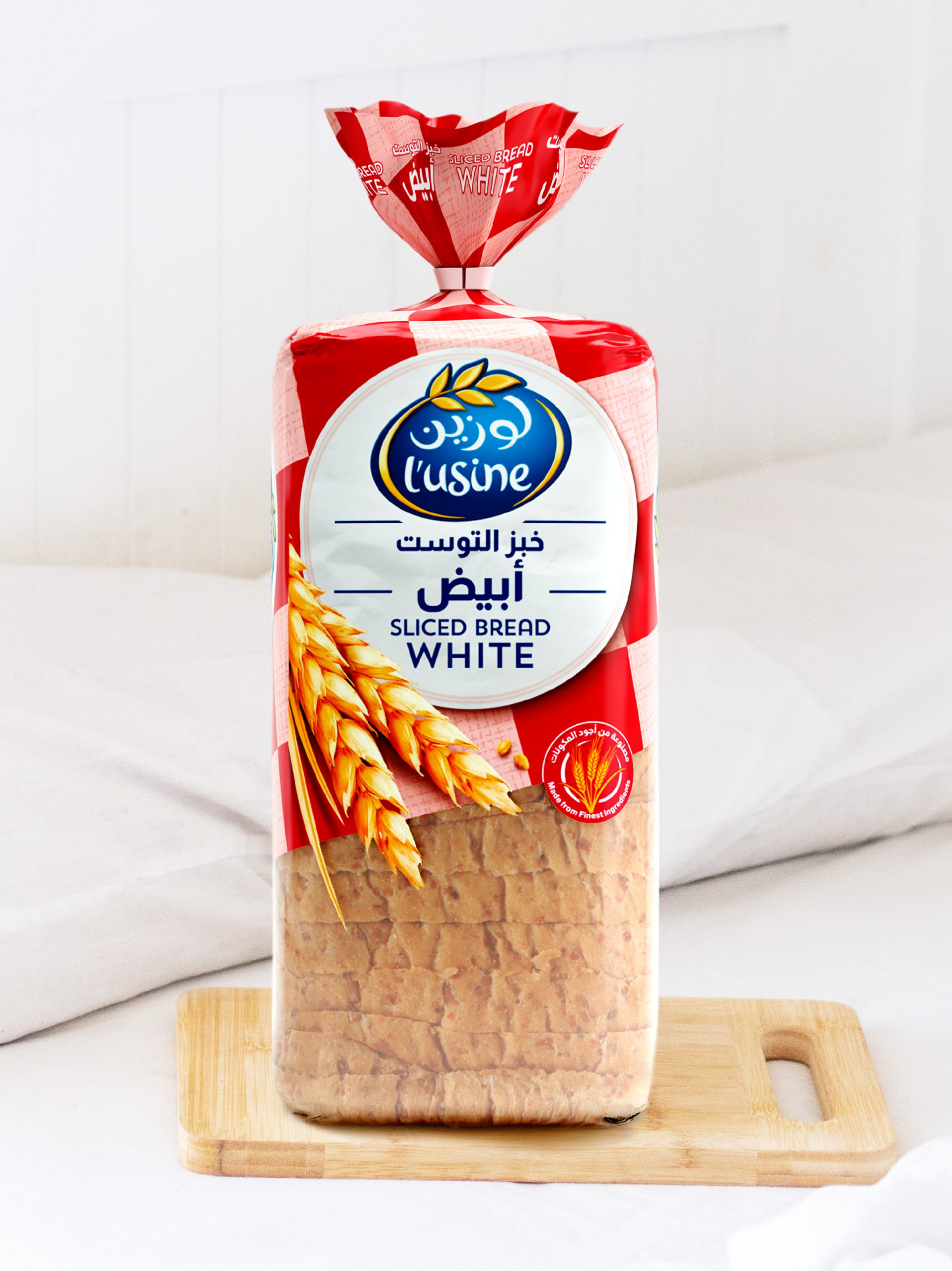
A major player across ultra-fresh, fruit juice, poultry, and industrial bakery categories, Almarai entrusted Lonsdale with a bold mission: redesign the packaging identity of its four flagship brands—over 400 SKUs in total—to reinforce its leadership in the GCC region and strengthen emotional bonds with consumers.
To meet the expectations of increasingly health-conscious audiences and inject emotional value into each product line, Lonsdale challenged traditional category codes to build unique, meaningful, and memorable graphic territories for each brand.
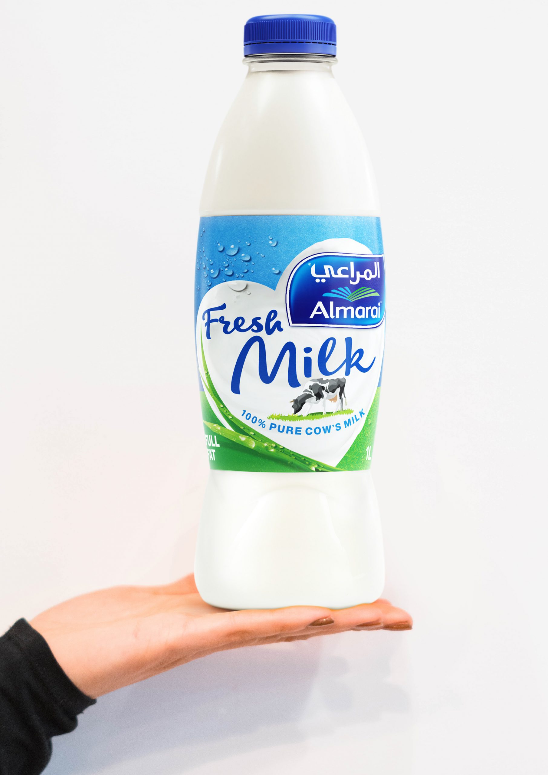
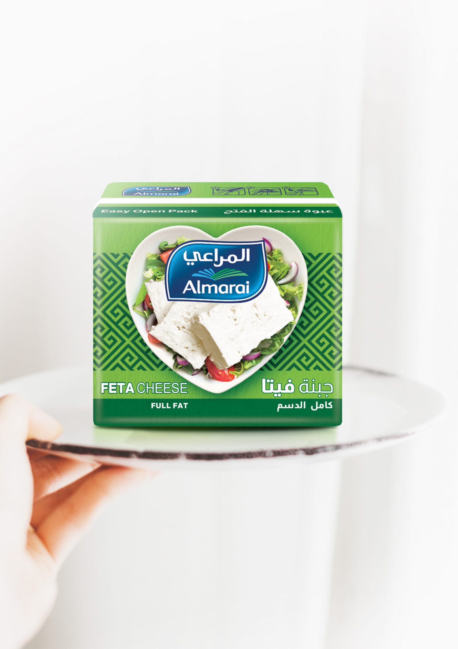
The result is a tailored visual identity for every product universe. A heart made of milk illustrates Almarai’s dairy range and the brand promise “Love tastes better.” A wooden crate brimming with fresh fruit embodies the juice line’s “Your natural choice.” Cooking aids feature a pattern of kitchen tools to evoke homemade quality. Alyoum poultry is wrapped in imagery of lush pastures and blue skies. L’Usine’s checkered design draws from traditional bakery codes to convey craftsmanship and oven-fresh quality. Albashayer’s vibrant mix of photos and illustrations captures the brand’s accessibility and joy.
This ambitious redesign was recognized at the Transform Awards MEA, earning Bronze for Best Visual Identity in the Food & Beverage Sector and accolades for Best Use of Packaging.
Selected work
Dove
View case study

Renault
View case study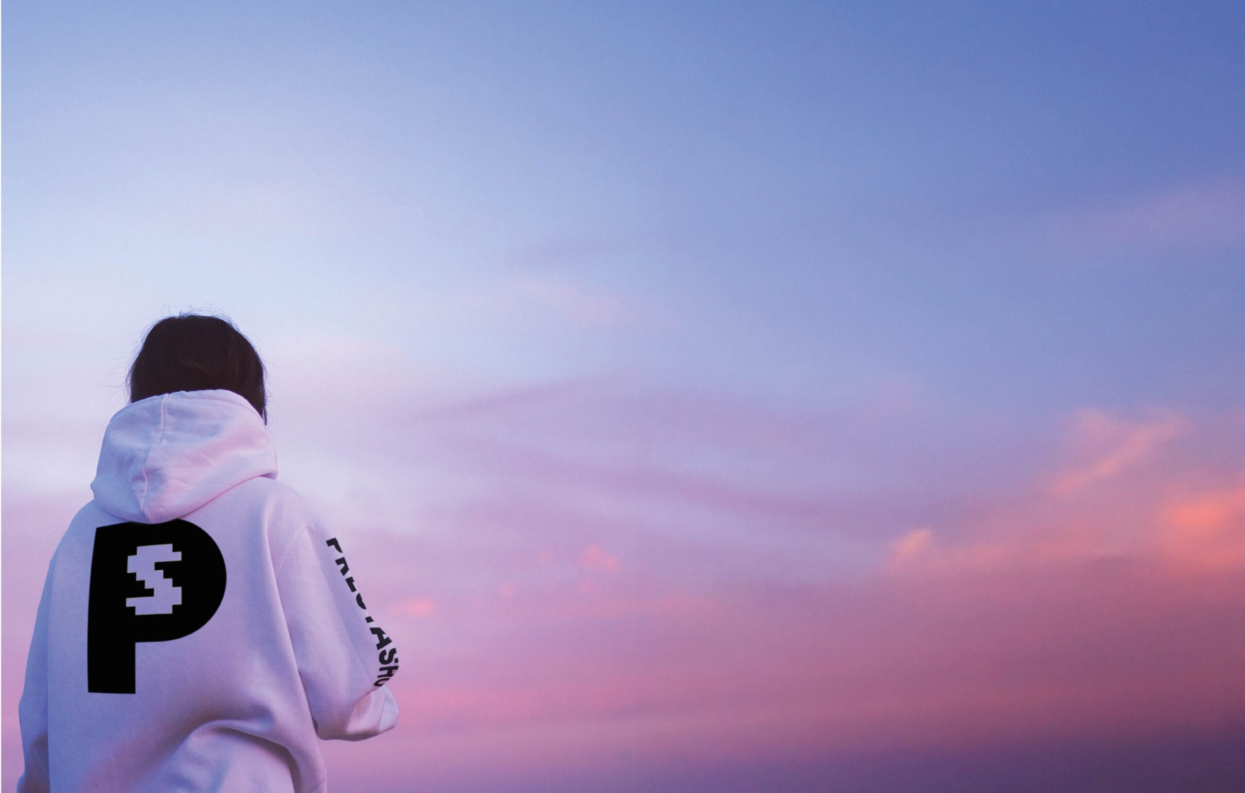

PrestaShop
View case study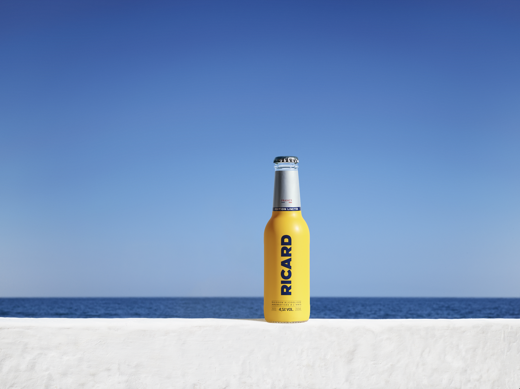

Ricard
View case study

Ferrero
View case study

Sanofi
View case study

Clarins
View case study

Rexel
View case study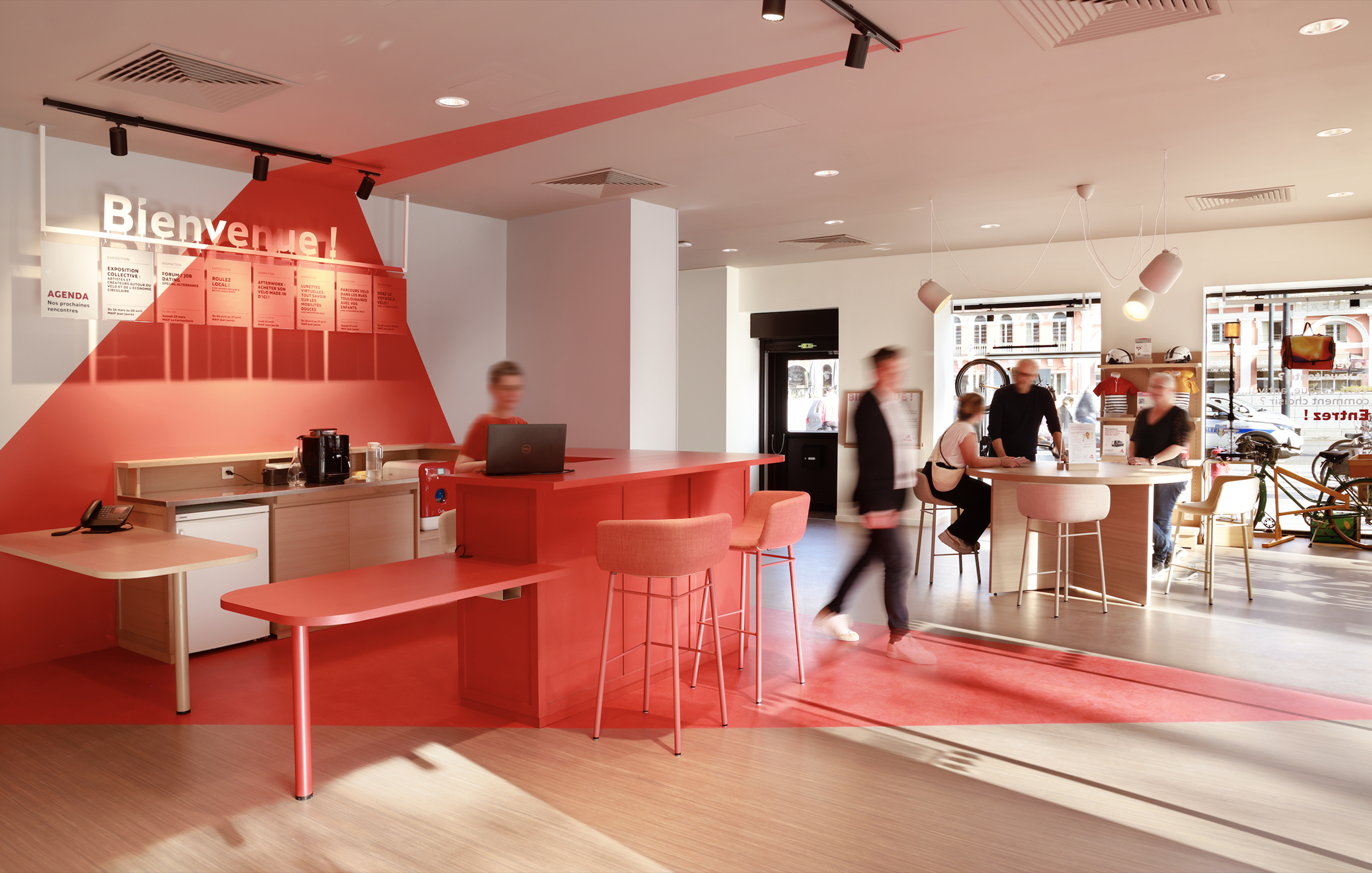

MAIF
View case study

Santé Verte
View case study

Maggi
View case study
Tiger Beer (Heineken Group)
View case studyDove
View case study
Renault
View case study
PrestaShop
View case study
Ricard
View case study
Ferrero
View case study
Sanofi
View case study
Clarins
View case study
Rexel
View case study
MAIF
View case study
Santé Verte
View case study
Maggi
View case study
Tiger Beer (Heineken Group)
View case study
Renault
View case study
PrestaShop
View case study
Ricard
View case study
Ferrero
View case study
Sanofi
View case study
Clarins
View case study
Rexel
View case study
MAIF
View case study
Santé Verte
View case study
Maggi
View case study
Tiger Beer (Heineken Group)
View case studyDove
View case study
Renault
View case study
PrestaShop
View case study
Ricard
View case study
Ferrero
View case study
Sanofi
View case study
Clarins
View case study
Rexel
View case study
MAIF
View case study
Santé Verte
View case study
Maggi
View case study
Tiger Beer (Heineken Group)
View case studyDove
View case study-
Dove
View case study -
Renault
View case study -
PrestaShop
View case study -
Ricard
View case study -
Ferrero
View case study -
Sanofi
View case study -
Clarins
View case study -
Rexel
View case study -
MAIF
View case study -
Santé Verte
View case study -
Maggi
View case study -
Tiger Beer (Heineken Group)
View case study -
Dove
View case study -
Renault
View case study -
PrestaShop
View case study -
Ricard
View case study -
Ferrero
View case study -
Sanofi
View case study -
Clarins
View case study -
Rexel
View case study -
MAIF
View case study -
Santé Verte
View case study -
Maggi
View case study -
Tiger Beer (Heineken Group)
View case study